We are so used to seeing Covid daily death figures in the following format:

In fact such figures mean nothing at all unless the figures are a) seen in the context of general death figures and b) corrected for those who would have died at similar times had Covid not been around.
The only way to get any grips on both a) and b) is to consider the Age Standardised Mortality (ASM) figures which are now conveniently available. These figures are deaths per 100,000 of a European standard population, something not very different from that of the UK. The average ASM is about 1000, per 100,000. Since the UK has a population of about 68 million, that’s 680 lots of 100,000, which means that we have on average 680 x 1000 = 680,000 deaths per year.
Here are the raw ASM figures from the above source.
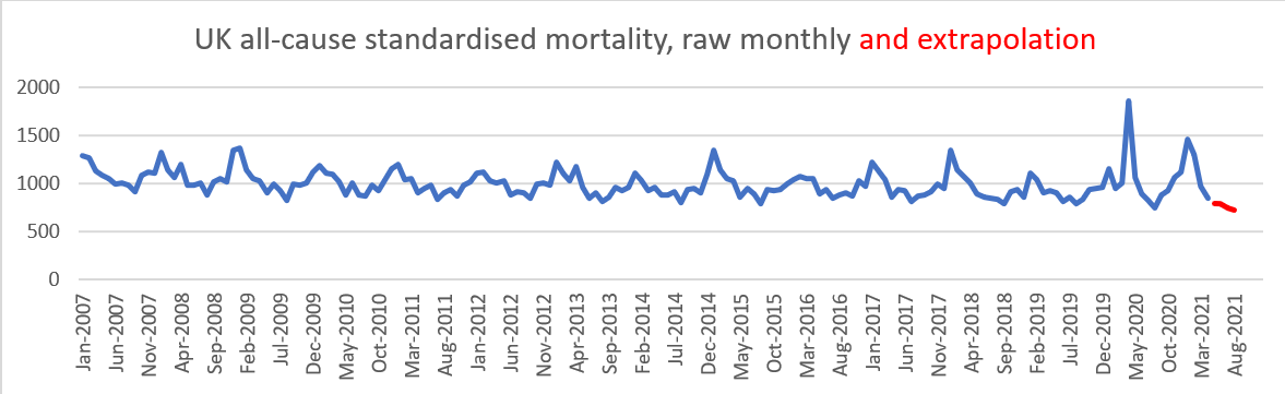
The red line is based on extrapolated figures assuming that the depression of the monthly figures of 13% below the 5-year history continues from May to August 2021.
The mortality figures show significant spikes of short duration due to Covid peaks. But these peaks are also associated with significant lows, well below historical averages. For instance, the April 2021 mortality figure was 13% below a five year average for that month. This is an extraordinarily low figure. It suggests that the death rate, in April 2021, may well have been reduced because of some deaths in both the Spring of 2020 as well as the winter season of 2020/2021.
We can make more sense of the pattern of mortality by averaging it over a number of months, in this case over 3 months.

In this graph I have extrapolated assuming that the reduction in deaths in May-August 2021 is 9% below the 5 year previous figure average, a less optimistic extrapolation than the current rate of 13% down.
The 12-month averages are, of course, annual figures, shifting in starting point as we go along the x-axis.
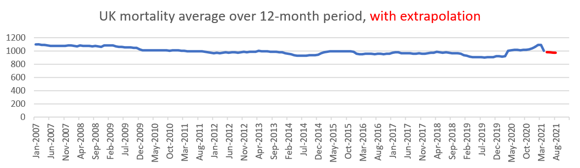
Again the ASM varies around 1000 per 100,000 but is noticeably stable. Mortality dropped in the years up to 2009. Since then it has remained fairly constant, averaging 988 per 100,000. More noticeable are the distinctly good years, 933 in 2014 and 907 in 2019, both of which years have increases in mortality in the subsequent years. There are good reasons to expect good years to be followed by bad years and vice versa. Two-year (24-month) mortality figures average these adjacent years, showing the overall trend.

Before we look at an amplified version of this graph, the first thing we should notice is its remarkable steadiness, hovering just under 1000 deaths per 100,000. Particularly noticeable is the unusual low in February-March 2020. There had been no significant respiratory deaths yet that winter and very few the previous year, leaving very many vulnerable people still alive.
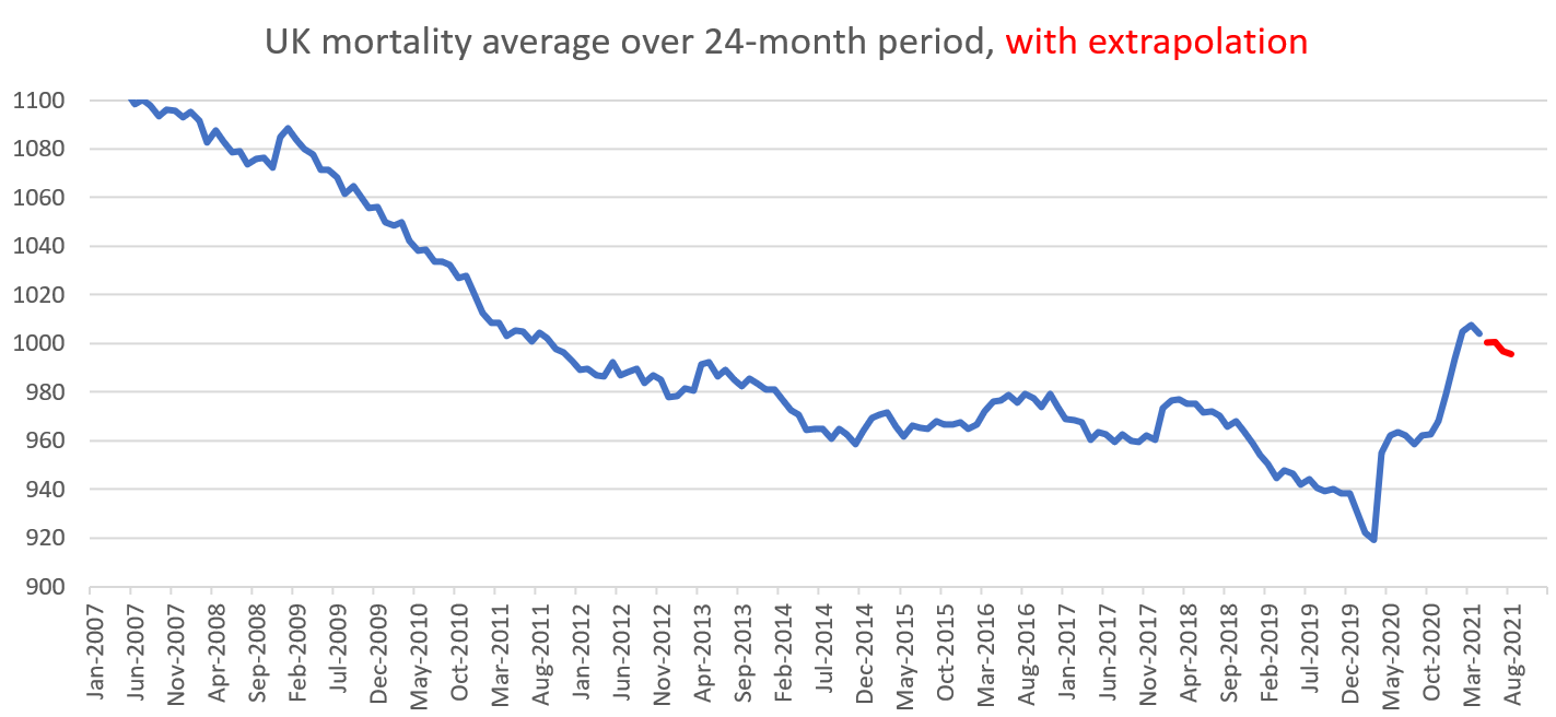
This graph shows clearly the falling mortality before 2014, its remarkable steadiness from 2014 to 2018 at about 980 per 100,000, a sudden dip late in 2019 and then the rises already referred to.
To make any estimate of ‘deaths due to Covid’ one needs a good grasp of what should be regarded as ‘normal’. A figure of 975 from both the graph and the ASM figures is a reasonable guess at what might be an average and therefore ‘expected’ annual UK ASM.
In June 2020, at the end of the first Covid winter (containing the very mild first part of the winter season and the rapid rise due to covid), the ASM for that year was 1020 per 100,000, which is 45 per 100,000 above our average, representing an 30,600 extra deaths.
Using our extrapolation figure which expects deaths in May and June to be 9% below those for a previous 5-year period (whereas they are currently running 13% below) the 20-21 winter season will end in June 2021 with an annual mortality of 981, which is 6 per 100,000 more than recent averages. This corresponds to an extra 4080 deaths.
Putting these figures together, it seems that a realistic figure for the total number of Covid deaths over the two winter seasons, Jul 2019 – Jun 2021, have been about 35,000 for two years, an average of 17,000 extra deaths per year.
These figures show, as did the graph of 2-year average mortality, that despite the sad deaths of some, the actual effect of death rate from Covid has been very mild indeed. In a city like Preston or Bath, with 100,000 people, normally 975 would die every year. The effect of Covid over 2 winter seasons has been to increase the number of deaths by about 25 per year to 1000.
17 over 80’s, all but one with pre-existing conditions.
7 of age 60-79, all with pre-existing conditions.
1 person under 60 also with pre-existing conditions.