Covid-19 has affected death rates in obvious ways: it has been a direct cause of death; it has occurred alongside other illnesses, resulting in some earlier deaths as a consequence; its disruptive presence throughout the health service has resulted in early deaths for some who have been denied life-saving treatment, or have been reluctant to seek treatment, for other conditions. As 2020 comes to a close, we can see the overall effect of covid over getting on for a whole year and its overall impact on the death rate for England and Wales.
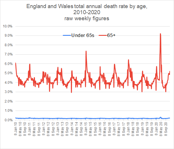
This graph shows the erratic nature of the weekly death figures. There are big spikes down at Christmas (and other holidays) when deaths are reported late and up just after New Year when the deaths over Christmas are added in. But this graph already shows some interesting figures.
The death rate for over 65s is about 4%. That means that 1 in 25 over-65s die within a year on average. But since there are about 11 million people over 65, that is about 440,000 over-65s deaths per year.
The death rate for under-65s is about 0.2%. We can see that that it has varied little as a result of covid. On average 1 in 500 under 65s die every year. And since there are nearly 50 million under-65s, that means that there are about 100,000 under-65s deaths per year.
The average total death rate for England and Wales is the 440,000 over-65s plus the 100,000 under-65s, giving a total annual death rate of about 540,000.
If we average the weekly death rate over a 4-week period, we see more of the underlying pattern.
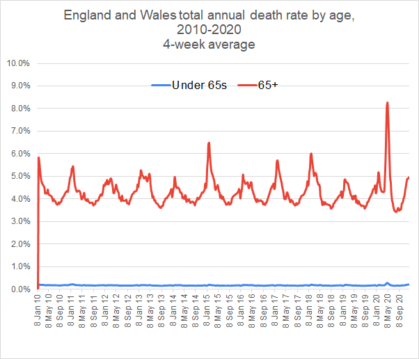
This shows that the death rate for over 65s varies quite a lot over the year, hitting a peak sometimes over 6% in the winter, dropping to below 4% in summer. This year we had a very high peak of over 8% in March but that was followed by particularly low death rate in August. Some of those who died in the April covid peak did not live to die at their expected time of August. This provokes the question as to what extent the reduced deaths of August compensated for the increased deaths in May. To find out the extent of this balance, we average over a longer period of 4 months.
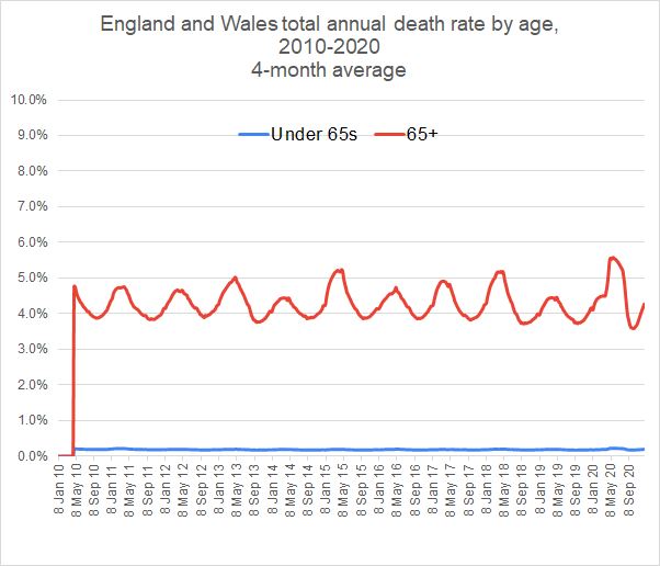
The 4-month average shows that 2020 is only a slightly unusual year. For the over-65s, the death rate rose to a high of 5.6%, while falling to an unusual low of 3.6% in September.
Certainly covid was instrumental in the particularly high death rate in April but there was another contributory factor: winter 2018-19 was a year in which there were relatively few flu deaths. This means that the vulnerable who would normally have died in that winter were still around in the peak of the 2019-20 season and among those who succumbed to covid.
We still see the particularly low death rate of 3.6% in September, a consequence of the vulnerable dying in April and not being around to contribute to the September statistics.
Monthly figures are not available for years before 2010. But whole year figures are available from 2006 and are shown here.
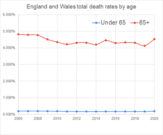
As can be seen, the 2020 death rate is entirely normal in the historical context, having an overall death rate for over 65s of 4.5%, slightly more than the peak of 4.4% in 2015 but less than the 4.8% figures from 2006 to 2008
Calculating total excess deaths
On the basis of previous years we predict how many deaths we would expect in a given year and compare it with the actual number of deaths. These figures we have been dealing with enable us to make a prediction for death rates for 2020.
If we confine our calculations to the recent low death-rate years, the average death rates for under-65s from 2013 week 52 to 2019 week 51 are as follows:
Under-65s – 0.169%
Over-65s – 4.321%
Using the figures below for the numbers in the two cohorts, this gives predicted deaths for 2020 of
Under-65s – 83,376
Over-65s – 459,545
Total – 562,922 (The extra 1 being a consequence of rounding issues.)
In fact the total deaths in England and Wales for 52 weeks from 2019 week 52 to 2020 week 51 has been 600,058. This is an excess death figure of 37,136. However, if we compare 2020 with 2006-8, we find that 2020 has had 27,491 fewer deaths pro rata than these years.
Even if the excess mortality in 2020 is close to 37,000, that includes deaths from all causes, including the knock-on excess deaths from all other diseases where treatment has been disrupted by attention to covid. (Many of us know perhaps more individuals who have had life-saving treatment disrupted than individuals who have died of covid.)
Bearing in mind that there have been suggestions that excess deaths for cancer may be, at a minimum, in the order of 10,000, it seems likely that the excess deaths due to covid will be well under 30,000. This is in stark contrast to the figure published for covid deaths in England and Wales of 65,795 (as on 31/12/2020).
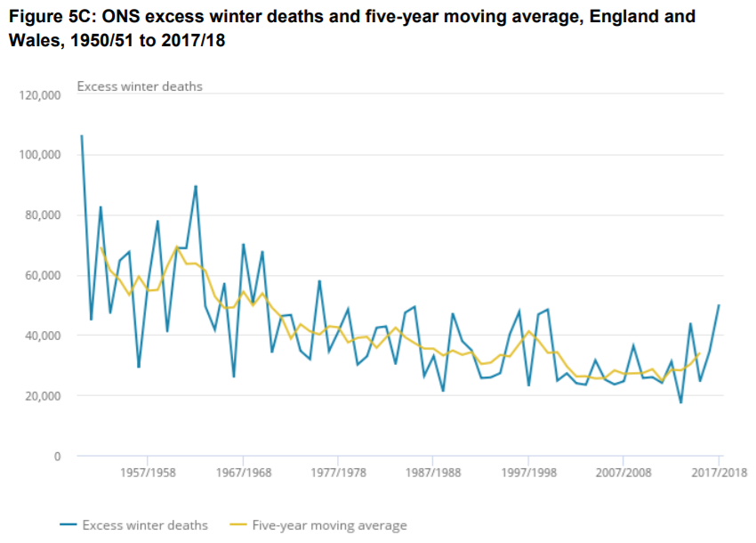
As can be seen from the graph below about excess winter deaths, seasonal deaths commonly vary by over 20,000 from one year to another. In which case, even were the 37,000 excess deaths this year all due to covid, that would not be far out from the range of swings that habitually occur from year to year – see the graph below.
Survivability – the chance of surviving the year
So far we have calculated in terms of death rates, the chance of dying in a year. But a different, and possibly more relevant, perspective is to consider the chance of surviving the year, a more useful way of seeing the impact of covid on our lives.
For those of us over 65, over the 6 years from 2013 to 2019, the death rate was 4.3%, meaning that our chance of survival was 95.7%. 2019 was a particularly good year in which survivability of over-65s was 95.9%. In 2020, with a death rate of 4.5%, survival rate has been 95.5%.
Here we can see how survivability has changed over the last fifteen years.
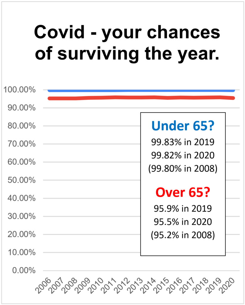
With over-65s survival rate consistently a little above 95% we can see that the effect of covid has been really very small. We can stop worrying and regard 2020 as a normal year.
Since first publishing this, the Office for National Statistics has crunched the figures. Their figures are for the 12 months to the end of November 2020. Here is the graph for age-standardised-mortality.
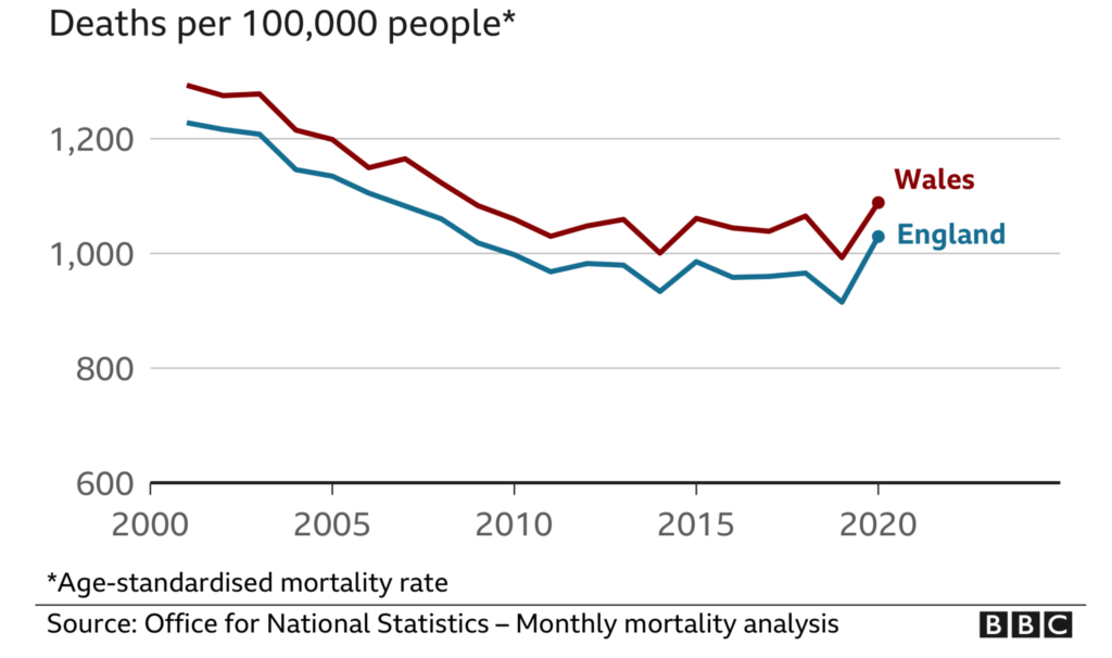
As you can see, this graph is pretty much identical in shape to my own graph on death rates above. Again it shows that 2020 is not a particularly exceptional year.
The BBC, in their publication of the ONS statistics, were very naughty. They focused on the excess deaths in 2020 being greater than any other year since the Second World War. Well, since the population (at 68 million compared with 47 million during WW2) and the proportion of over-65s (18% as opposed to 10%) are greater in 2020 in any other year, of course we should expect the death rates to be greater.
Statistical notes
These figures are produced by taking the ONS published weekly death rate figures, multiplying them by 52 to give an annual death rate figure and dividing them by the numbers in the two cohorts (0-64 and 65+).
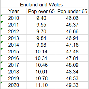
Numbers in the two cohorts are calculated from published UK population figures, reduced by 11.3% decreasing to 11.0% from 2010 to 2020 to account for those in Scotland and Northern Ireland.
Percentage of over-65s in the UK population is derived from the sources below, interpolating between fixed point data where necessary. Here are the figures used.
https://www.thelancet.com/journals/lanonc/article/PIIS1470-2045(20)30388-0/fulltext