Random thoughts, often numerical. There is no facility to comment publicly but if you wish to make contact it is easy to guess the webmaster's email address.
In an extremely vague broad measurement of Domestic Hot Water consumption, the average house was found to use about 120 litres. About 4% of houses consumed more than 300 litres.
The Hot Water Association says that, for high consumption, one should allow up to 70 litres of water per person.
Imagine and large and full house with 6 people, each consuming 70 litres of hot water per day. That is 420 litres (420 kg) of hot water per day.
Hot water in the home typically requires temperature increases of 40 K to get it from averagely cold (10 °C) to averagely hot (50 °C).
So energy needed to heat all this hot water = 420 kg x 4.2 J/kg K x 40 K = 70,560 kJ in 24 hours.
24 hours = 24 x 3600 seconds = 86,400 seconds.
The average power needed to heat our extravagant hot water system is therefore: 70,560 kJ / 86,400 s = 0.82 kW.
Therefore, if you have an extravagantly large water consumption, in a pretty full house, you will still only need an average power of less than 1 kW to heat all that hot water.
Typical boiler powers for an average house are over 20 kW. Compared with boiler power, the power needed for hot water is trivial. Therefore, if you get your hot water system and storage right, you need to allow only an extra kilowatt, even for extravagant hot water provision.
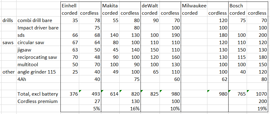
Where I used to work, I could buy Duracell Professional batteries at low prices through a buying agency. These prices were comparable with prices available on Ebay.
Why did I buy Duracell? Because I could get, for instance, AA cells, of a good quality, for about 25p. But of late the prices have rather climbed, generally to over 40p, as the adverts at the bottom show, causing me to shift to Energizer, which were available at about 34p (below).
More recently I noticed Aldi’s own line of batteries and, since most of Aldi stuff is of reasonable quality, I thought them worth trying. The question was how to make a fair test.
I resorted to my Lidl battery toothbrush. It takes two AA cells. I inserted one Duracell AA and one Lidl AA. Since the 2 cells are in series, exactly the same charge flows through them. All I needed to do was to test each battery every so often and compare their states of charge along the way.
In fact the Aldi AA cell performed exactly the same as the Duracell AA cell and, since Aldi AA cells are 21p, they are an obvious good buy.
My electric toothbrush (Lidl, not Aldi) draws a current of 200 mA. It has a timer which tells me when 2 minutes’ brushing is up and so it is used for very close to 4 minutes every day. 15 days’ use is 1 hour total use, using, therefore, 200mAh of capacity.
The capacity of batteries depends on the discharge current. At 100 mA, the capacity of a Duracell AA is 2.2 Ah. At a discharge current of 500 mA, the capacity decreases to 1.3 Ah. We might guess that the capacity at 200 mA is about 1.8 Ah, meaning that the batteries will last 9 lots of 15 days, or about 4 months – something that was roughly how long they did last.
Pedantic point from teaching physics. In the army, that thing that you put to your shoulder or have in your hand is a rifle or pistol. Guns are very much bigger things and the collective noun for several guns is a battery. In the same way one cell is a cell; a collection of more than one cells is a battery.
This is an update – simpler than the original – of an adjacent post.
Bikes ‘gear up’ our feet’s movement so we can travel more quickly than with feet alone. A numerical representation of the gearing enables us to make comparisons.
Gearing up, the Gear gain, happens in two stages.
Radius ratio In the first penny-farthing (or high wheel) bicycles, gear gain was provided by one single factor – the fact that our feet travel in a small radius circle and the wheel itself has a larger diameter.
This gain, the radius ratio is the ratio of the bike wheel radius to the radius of the pedal cranks.
Radius ratio = (bike wheel radius)/(crank radius)
Typical large wheels (700c) on a modern bike have a wheel diameter of 350 mm (half the diameter). Crank lengths are typically 170 mm.
So radius ratio = (bike wheel radius)/(crank radius) ratio = 350/170 = 2 (near enough).
Since the wheel and crank radii for all normally large wheeled bikes are very similar, you can assume that the radius ratio for all bikes with large wheels is 2.
Gear ratio Modern bicycles have gears which give gain in addition to the radius ratio. The gear ratio tells you how many times the rear wheel goes round for each turn of the pedals. The cranks turn a chainwheel which drives a rear cog. The cog is mostly smaller than the chainwheel gearing up the motion. For very low gears the sprocket can be larger than the chainwheel, gearing it down.
Gear ratio = (chainwheel teeth)/(cog teeth)
For a chainwheel of 42 teeth driving a cog of 14 teeth,
Gear ratio = (chainwheel teeth)/(cog teeth) = 42/14 = 3
Gain ratio Gain ratio is the overall effect of the gearing caused by both the radius ratio and the gear ratio. You find the overall gain ratio by multiplying the two together. For the bike above,
Gain ratio = radius ratio x gear ratio = 2 x 3 = 6
With this gain ratio, your bike is going 6 times as fast as your feet are moving. When your feet are moving at 4 mph, your bike is going at 24 mph.
The concept of gain ratio was suggested by Sheldon Brown. Like many of his suggestions it made complete sense…but has largely been ignored.
Internal gear hub gain Gearing gain can also be provided by an internal gear hub. Here is part of a Brompton folding bicycles with a compact 2-gear derailleur coupled with an internal gear hub.
The Brompton has 16″ x 1-3/8″ tyres with a radius of 204 mm. The crank length is 170 mm.
Radius ratio = 204/170 = 1.2
The Brompton chainwheel has 50 teeth and the 2-speed derailleur has 13 teeth on its smallest cog.
Derailleur gain = 50/13 = 3.85
The wide-range Sturmey-Archer S-RF5 hub has a gain of 1.6 in its top gear. When fitted to the Brompton with that derailleur,
overall top gear ratio = derailleur gain x hub gear gain
overall gear ratio = 3.85 x 1.6 = 6.16
Gain ratio = radius ratio x gear ratio = 1.2 x 6.16 = 7.38
The combination of the derailleur and internal hub gears gives this small-wheeled bike significantly more gain than the large-wheeled bike above.
Other ways of measuring gear gain There are a couple of other common ways of measuring gear gain which are in common use. I include them for completeness.
Gear inches Gear inches is the ‘equivalent diameter’ of a wheel that would be needed for a penny-farthing bike with the same gear gain. Think about the bike’s gear ratio ‘magnifying’ the diameter of the rear wheel.
Gear inches = gear ratio x diameter of the rear wheel.
The Brompton bike above has 16” diameter wheels.
So gear inches = 6.16 x 16” = 98.6”
Making the reasonable approximation that all cranks are 170 mm long, here is the conversion between gear inches and gain ratio.
Gear inches = Gain ratio x 13.4
Development in metres In countries that use metric measurements, the usual system is development in meters. This is the distance that the bicycle moves with each revolution of the pedals.
Development = circumference of wheel x gear ratio
= 2π x radius of wheel x gear ratio, where π is roughly 3.14
Any units may be used for this formula. You can calculate development in inches by using inches for measurements of the wheel.
For the Brompton above, where the radius of the wheel is 204 mm (0.204 metres) and the gear ratio 6.18,
Development = 2 x 3.14 x 0.204 metres x 6.18 = 7.9 metres.
If (again) we assume that cranks are 170 mm long, here is the interconversion:
Development = 1.07 x gain ratio.
Remembering that the absolute value of development is not very important, near enough the gain ratio (very easy to calculate) is equal to the the development in metres.
The simplicity of gain ratio Now we’ve calculated development in metres and compared it with Sheldon Brown’s gear ratio, we see how much simpler gain ratio is to calculate and use as a method of comparison. One calculates the radius ratio once for whatever bike one is considering and multiplies it by the gear ratio.
Since for all large wheel bikes, the radius ratio is very close to 2, double the gear ratio and you have the gain ratio, which is near enough the development in metres.
Gain ratio, cadence and speed To a close approximation, again assuming that the crank length is 170 mm,
Speed (in km/h) = (Gain ratio x Cadence)/15.6
Speed (in mph) = (Gain ratio x Cadence)/25
Given that a cadence of 75 per minute is pretty brisk and that Speed (in mph) = (Gain ratio x cadence)/25 = Gain ratio x 75/25 = 3 x gain ratio.
At a cadence of 75 per minute, speed (in mph) = 3 x gain ratio (or 3 x development if you prefer).
For those living in fully metric countries,
At a cadence of 75 per minute, speed (in km/h) = 5 x gain ratio (or 5 x development)
With our Brompton bike, having a gain ratio of 7.38, being pedalled with a cadence of 75 rotations per minute,
Speed = 3 x 7.38 = 22 mph.
Ellse approximationsfor bikes with normally large wheels
Development in metres = gain ratio = 2 x gear ratio
Speed at cadence of 75 = 3 x development or gain ratio (mph) 5 x development or gain ratio (km/h).
Chainset 48-35T, cassette 10-33T So top gear ratio = 48/10 = 4.8
Using Ellse approximations for top gear. 1. Development in metres = gain ratio = 2 x 4.8 = 9.6 2. Speed in top gear at cadence of 75 = 3 x 9.6 = 30 mph = 5 x 9.6 = 50 km/h
Comparing the different units For bikes with full-sized wheels, where radius ratio is about 2, this table provides a useful comparison.
Bikes ‘gear up’ our feet’s movement so we can travel more quickly than with feet alone. This gearing up happens in three stages.
Radius gain Our feet press on pedals which turn the cranks which are typically 170 mm radius. But the bike wheels are bigger than that, even on my Dahon folding bike where they are 500 mm diameter, or 250 mm radius. The radius gain is the ration of the wheel radius to the crank radius, in this case: 250 mm/170 mm = 1.47
Chainwheel-sprocket gain The cranks turn a chainwheel which, on my Dahon folding bike, has 47 teeth. The chainwheel drives a rear sprocket which has 17 teeth. The chainwheel-sprocket gain is the ratio of the chainwheel to the sprocket, in this case: 47/17 = 2.76
Internal hub gain My Dahon has a hub gear at the rear which has a top ratio of 1.545 and a bottom ratio of 0.632, gearing down in the low gears.
Overall gain ratio The overall gain ratio is radius gain x chainwheel-sprocket gain x internal hub gain.
So in top gear where the internal hub gain is 1.545: overall gain ratio = 1.47 x 2.76 x 1.545 = 6.3
In top gear, the bike is moving six times as fast as the cyclist’s feet. Imagine you were walking briskly at 4 mph. If your feet are moving at the same speed on the bike pedals, you will be travelling at 6 x 4 = 24 mph.
Metres development This is the distance travelled by the bike (in metres) per rotation of the cranks.
When you turn the cranks once, your feet travel round a circle of radius 170 mm, 0.17 m. The diameter of that circle, d, is 0.34 m. The distance travelled all the way round the circle, d, is πd, where π is about 3.142. So the distance travelled by the feet for one rotation of the crank: = πd = 3.142 x 0.34 = 1.07 m. When the cranks are turned 1 turn, the feet move a distance of 1.07 m. The bike travels 6.27 times as far: = 1.07 x 6.27 = 6.7 metres.
This distance of 6.7 m is the development of my Dahon, meaning that in top gear it travels 6.7 metres for each turn of the cranks.
Bottom gear ratio The internal hub gain is actually a reduction for bottom gear, where it is 0.632. So the overall gain ratio in bottom gear = 1.47 x 2.76 x 0.632 = 2.56. The development = 1.07 x 2.56 = 2.7 m.
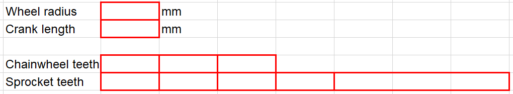
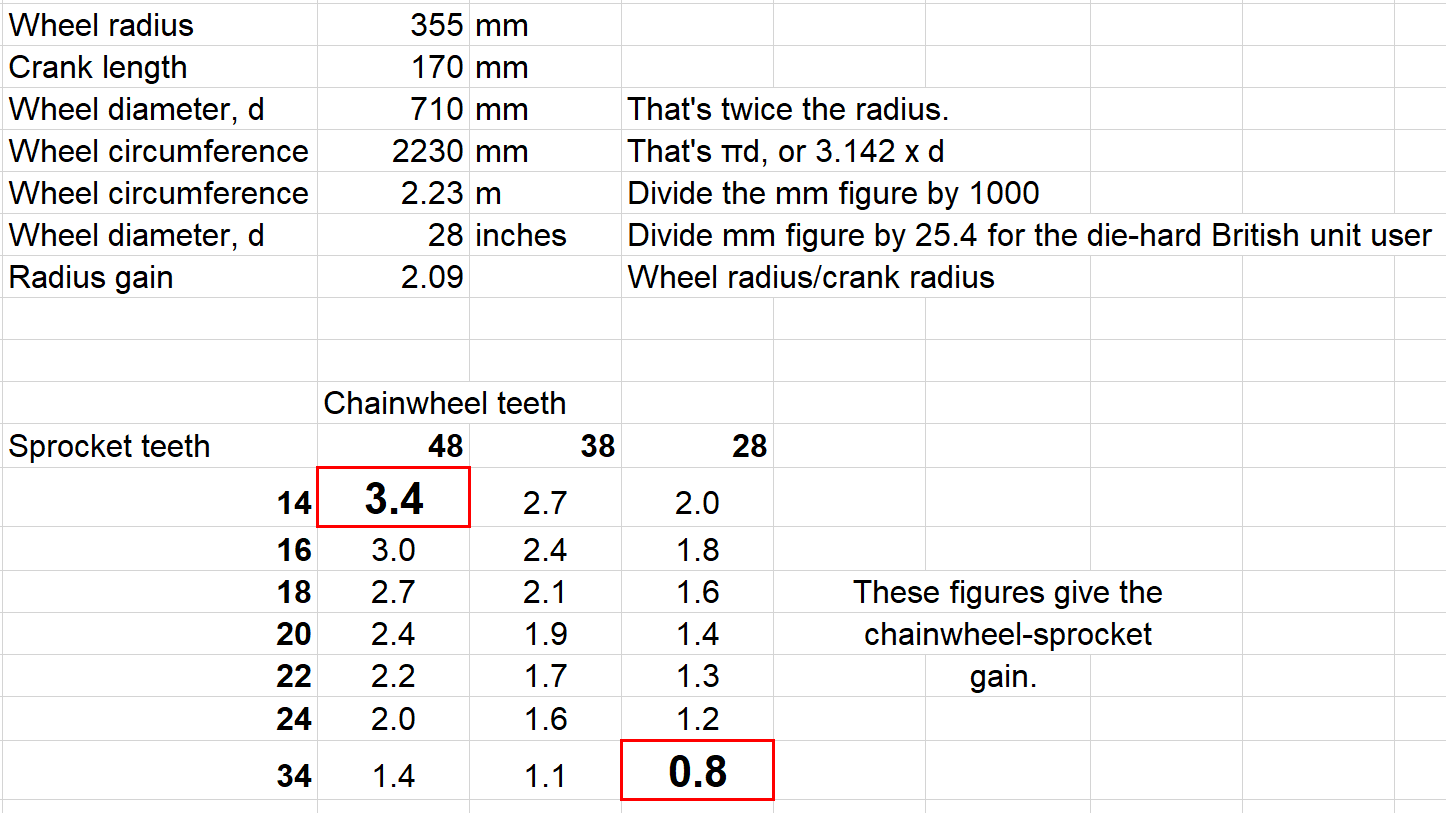
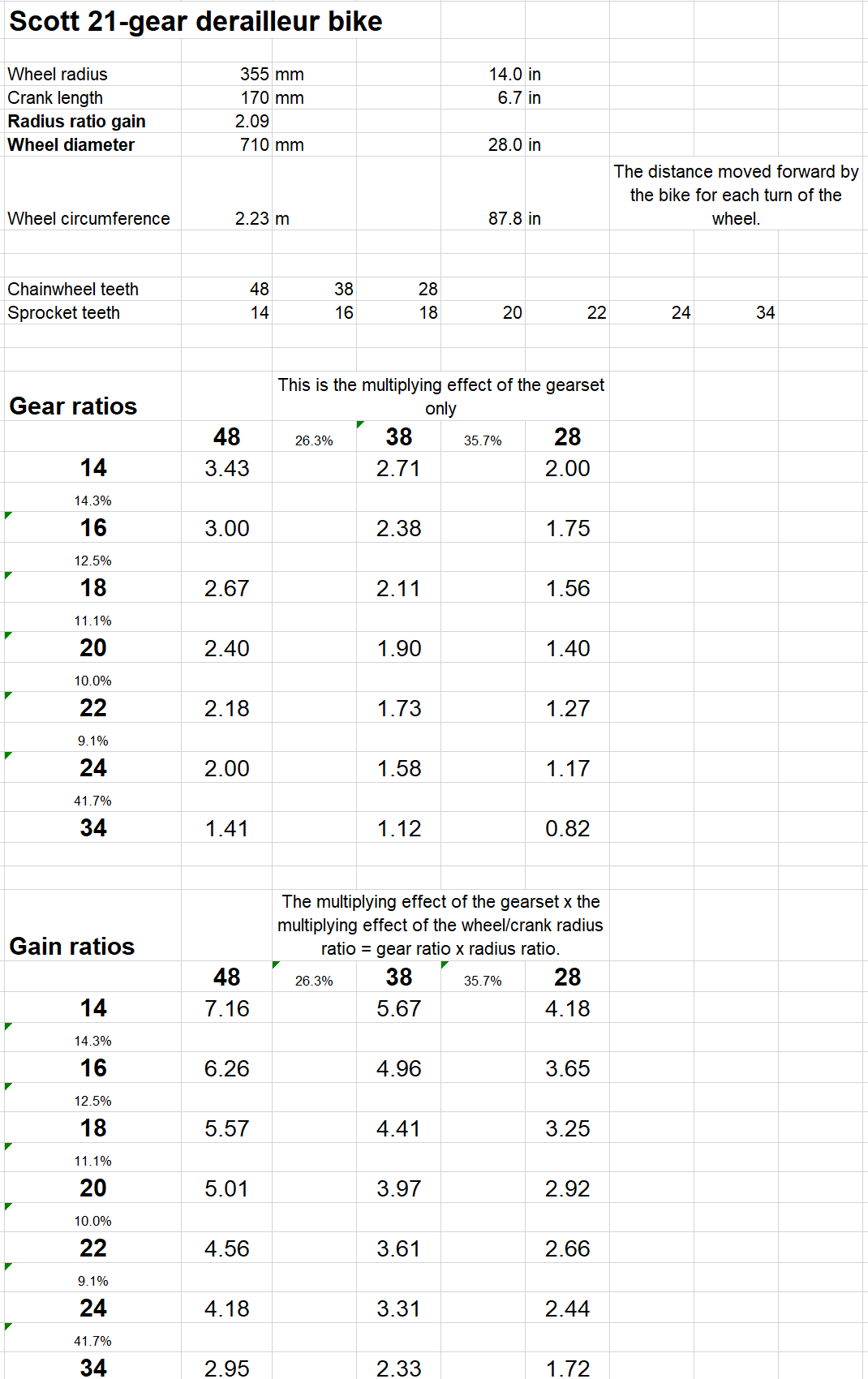
Calculating the gears for a derailleur bike Make a table like this for your derailleur bike and fill in the blanks. If you have more than 7 sprockets on the rear cassette the table will need to be wider.
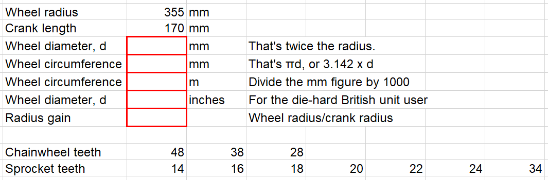
Here are the figures for my derailleur bike. I’ve also added some boxes and highlighted them in red for a few calculations.
To calculate the diameter in inches, divide the mm figure by 25.4.
Here are the above calculations complete and the chainwheel and sprocket figures rearranged to complete a gear table for them.
I’ve completed some of the figures so you can see how they are calculated – by dividing the number of chainwheel teeth by the sprocket teeth to give the chainwheel-sprocket gain.
Here is the completed gear table, ready for us to complete the calculations.
There is no internal hub gear on this derailleur bike. So the overall gain ratio in top gear: = radius gain x chainwheel-sprocket gain = 2.09 x 3.4 = 7.1
Bottom overall gain ratio: = radius gain x chainwheel-sprocket gain = 2.09 x 0.8 = 1.7
Metres development It’s hardly worth calculating the development because we know that the development in metres is roughly equal to the overall gear ratio. I leave the calculations to you.
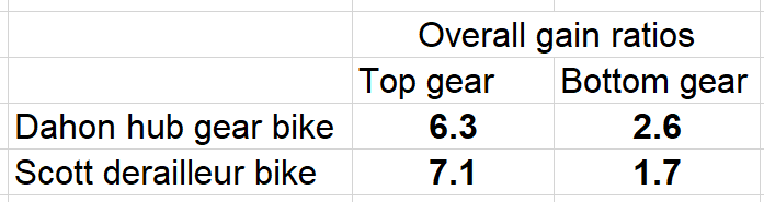
Comparing my two bikes
It’s obvious why I struggle with my Dahon on steep hills. Perhaps I don’t need the very low overall gain of the Scott. But something lower than 2.6 would be helpful up steeper hills.
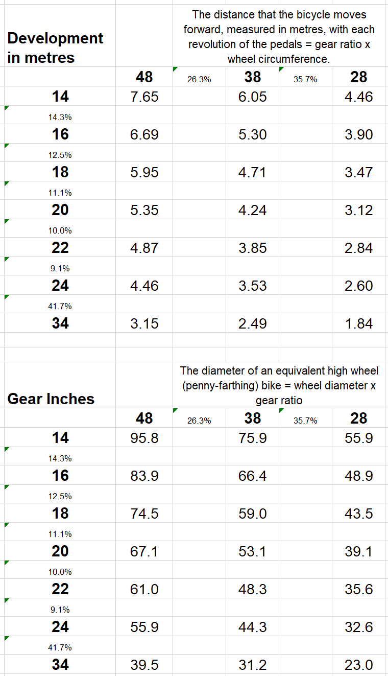
Gear inches There is one more unit used to measure gears – gear inches, the diameter of an equivalent high wheel (penny-farthing) bike. Gear inches are calculated by wheel diameter x gear ratio
So the top-gear inches for my derailleur bike are: 28 inches x 3.4 = 95″
This means that the top gear on this bike is like riding a penny-farthing with a front wheel 8 ft (2.4 m) in diameter.
A useful fudge, or quick conversion Closely enough: 100 gear inches = 8 metres development = 7.5 metres gain ratio.
Complete figures for my Scott derailleur bike. Here we are!
The cost of storing energy in batteries is getting less as this report shows, quoting a figure of about $135/kWh for the cost of storage in 2020. That’s about £100/kWh.
Nissan Leaf replacement battery In the US, a 30 kWh replacement battery costs about $4000, about £3000. That’s £100/kWh – about the same as the Bloomberg figure.
The real cost of storage– 1 the battery cost of storing energy What you are buying for £100/kWh is the ability to store energy. But that ability to store decreases with time. Even with the most careful charging and discharging, a battery can be expected to lose 20% of its capacity after 1000 cycles and 40% after 2000 cycles. For a rough cost of storing each kWh, let’s assume we get a total of 2000 cycles and the average capacity is 70% of the original capacity.
For a £100 battery storing 1 kWh new, it stores an average of 0.7 kWh for 2000 cycles, which is 1400 kWh. Therefore cost per kWh stored is £100/1400 = 7.1p. Your £100 battery, if it is very carefully charged and discharged, will cost you 7p for each kWh that you store.
2 – the inefficiency cost of storing energy You don’t get 1 kWh out of a battery for every kWh that you put in. That’s because the process of charging and discharging involve current flowing through resistance, hence energy loss. And the chemical changes caused by charging and discharging waste energy. If you charge a battery slowly, then its efficiency can be over 90%. If you charge or discharge quickly (say in one of those motorway fast chargers) the efficiency can be as low as 70%. A reasonable figure for the overall charge/discharge efficiency is around 85%. This means that there is a loss of 15% of the energy you put into a battery. Even if you charge at a low night-time rate of around 13 p/kWh (see below), you lose 15% of that. That is about 2 p/kWh. It’s 3 p/kWh if you charge at a daytime rate. The total cost of storing energy in a battery is the battery cost plus the inefficiency cost, ie 7p + 2p = 9 p/kWh.
Domestic electricity costs The current Octopus tariff which, with an Economy 7, tariff quotes a night rate of 13.24p and a day rate of 20.25p. That’s a difference of 7p per kWh.
But remember, every time you store a kWh in a battery, that process costs you 9p. You may think that you are paying only 13p a kWh to charge your car battery, but the battery storage costs bump that up to 22p/kWh. And if you charge you car during the day, or at a place that does not have cheap night rate electricity, it is costing you 30p per kWh.
Tesla Powerwall For reference, a Tesla Powerwall costs £9,810 including VAT for a UK domestic installation. It has a capacity of 13.5 kWh – over £700/kWh, albeit in a nice box with battery management equipment. That’s 7 times as much as our batteries above. So the storage costs of a Tesla Powerwall are 7 times as much, which is 50p/kWh. But it’s obvious that Tesla make loads on the Powerwall and the Powerwall could be sold for significantly less than the current prices.
The null hypothesis Once Covid has spread significantly among a population, normal lockdown actions have no significant effect on the spread of the disease.
Definitions of significantand normal By ‘spread significantly’ I mean the sort of spread that was observable in most countries, the UK in particular, well before there was a general awareness of the presence of the virus, say in January 2020. By ‘normal lockdown actions’ I mean those that were applied generally in the UK. By ‘no significant effect on spread’ I mean no effect that could not reasonably be regarded as a statistical fluctuation. Another way of stating the null hypothesis is ‘by the time we know we have Covid, there is nothing we can do about it.’
Reasons for the null hypothesis There is an excellent paper, the Routes of Transmission of the Influenza Virus, published by the Department of Heath. Summarising relevant content and applying it to Covid one sees the following.
1. Scientists have tried to transmit viruses by contact with surfaces (fomites). But their best attempts to do so have failed. This accords with the lack of evidence for the fomite transmission of Covid. So all our washing supermarket trolleys, prohibiting trying clothes on in shops and cleaning chairs has likely done nothing to restrict the transmission of Covid and has been a waste of time. As the Nature article quoted is titled, Why are we still deep cleaning?
2. Respiratory viruses are transmitted by personal contact. The evidence for this is good. This is easy to stop. We’ve stopped it and Covid has still spread. From this we conclude that Covid spreads by means other than fomites and personal contact.
3. There is no doubt that respiratory viruses are transmitted by droplets. But droplets fall to the ground in a few feet. In any case, droplets are readily stopped by the upper respiratory tract and do not penetrate deeply into the lungs, where the body is more susceptible to infections. In any case, we’ve massively restricted the transmission by droplets by stopping stopped sneezing and coughing in public and the wearing of masks. Even so, Covid has spread. So there must be a mechanism other than fomite, personal contact and droplet that transmits Covid.
4. The final mechanism for transmission of respiratory viruses is aerosols, about which there is some knowledge, but there are clear limits to our knowledge. So far as the evidence pre-covid about influenza is concerned, the Department for Health paper referred above states: i) There is good evidence for aerosol transmission between animals, despite lack of research about transmission between humans. ii) Lower doses seem to be needed with aerosols into the lung compared with virus drops into the nose. iii) Resulting illness from aerosol inoculation seems more severe. iv) Though there is no good quality epidemiological data to support transmission via aerosols, even long-range transmission cannot be ruled out and and short-range aerosol transmission may be significant.
As the Nature article already quoted states, ‘As evidence has accumulated over the course of the pandemic, scientific understanding about the virus has changed. Studies and investigations of outbreaks all point to the majority of transmissions occurring as a result of infected people spewing out large droplets and small particles called aerosols when they cough, talk or breathe.‘
As already discussed, we are aware of droplets and our measures to control droplet spread are well understood and well implemented. What we now know is that aerosol transmission is an important mechanism for transmission and, since we have implemented methods that markedly reduce, possibly largely eliminate other forms of transmission, we realise that aerosol transmission is sufficiently able to spread Covid that, even if we eliminate other transmission methods, Covid still spreads.
Agreement about how Covid is spread. The scientific consensus is now that Covid is airborne and spread effectively by aerosols. Here are some references.
A quick google reveals many further sources showing that Covid is airborne.
How can we stop the spread of aerosols? Those of us who live near farms on which various forms of muck is spread as fertiliser, know that everyone downwind smells the much that has been spread. Those who live near landfill sites are also used to the smells of decomposing which are produced. If you visit Burton, you smell Marmite, a bi-product of the brewing there. And there is no way to stop airborne smells.
In the same way it is not possible to stop airborne viruses. They spread around like smells and we all encounter the viruses.
The null hypothesis Once Covid has spread significantly among a population, normal lockdown actions have no significant effect on the spread of the disease.
So, once it’s around, there’s nothing we can do to stop the spread of Covid? That’s pretty much the case. California locked down hard: Florida didn’t. Death rates were similar in the two states. There is similar evidence from comparing a whole range of states in the US and seeing that their various lockdown policies made not difference.
But if you don’t like what I have written, prove me wrong. Show any situation in which lockdown action has had any significant effect. After all, that’s how science proceeds: one makes a null hypothesis and invites others to prove one wrong. One doesn’t bumble along saying ‘wearing masks helps’ if one has no evidence that they do so.
We are so used to seeing Covid daily death figures in the following format:
In fact such figures mean nothing at all unless the figures are a) seen in the context of general death figures and b) corrected for those who would have died at similar times had Covid not been around.
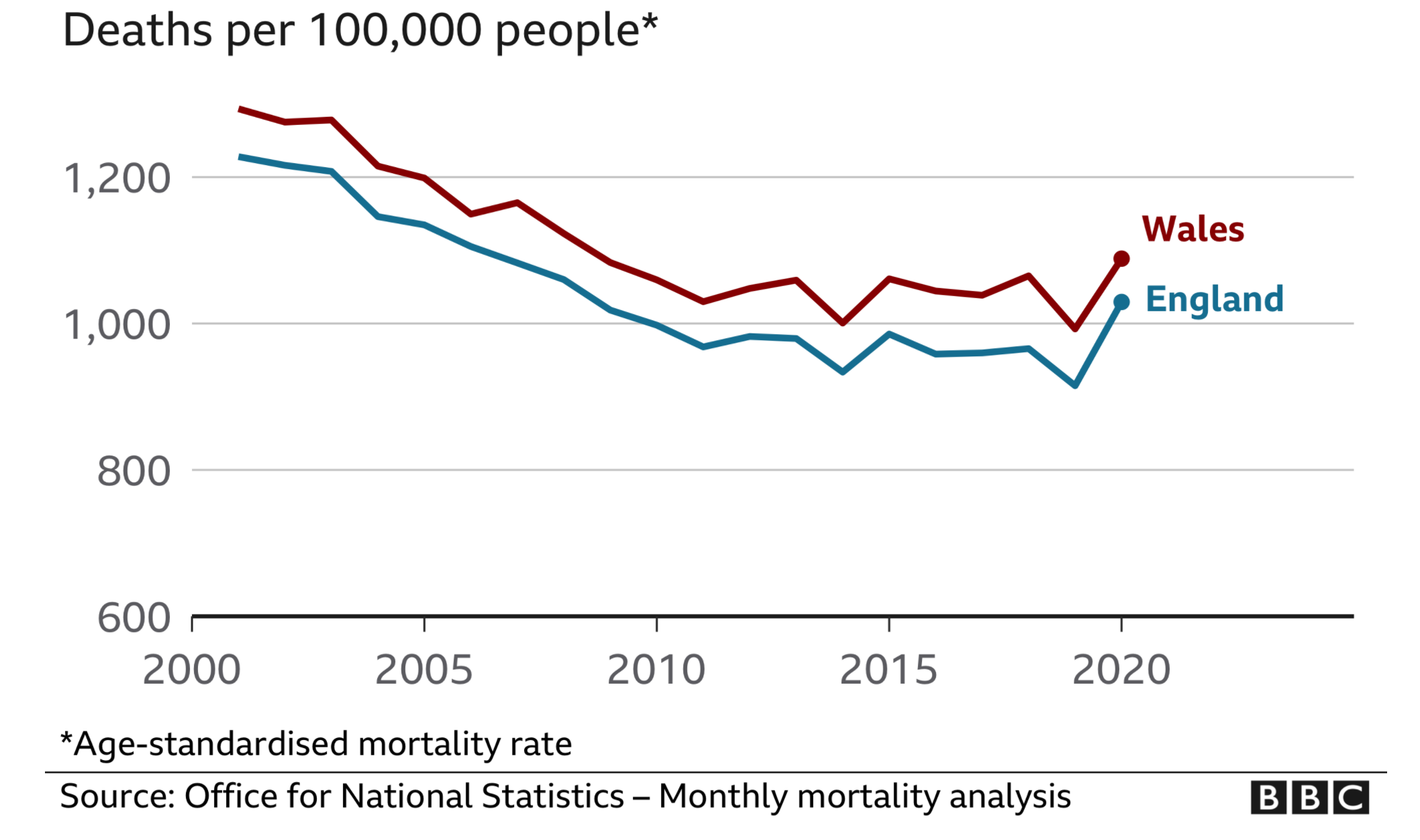
The only way to get any grips on both a) and b) is to consider the Age Standardised Mortality (ASM) figures which are now conveniently available. These figures are deaths per 100,000 of a European standard population, something not very different from that of the UK. The average ASM is about 1000, per 100,000. Since the UK has a population of about 68 million, that’s 680 lots of 100,000, which means that we have on average 680 x 1000 = 680,000 deaths per year.
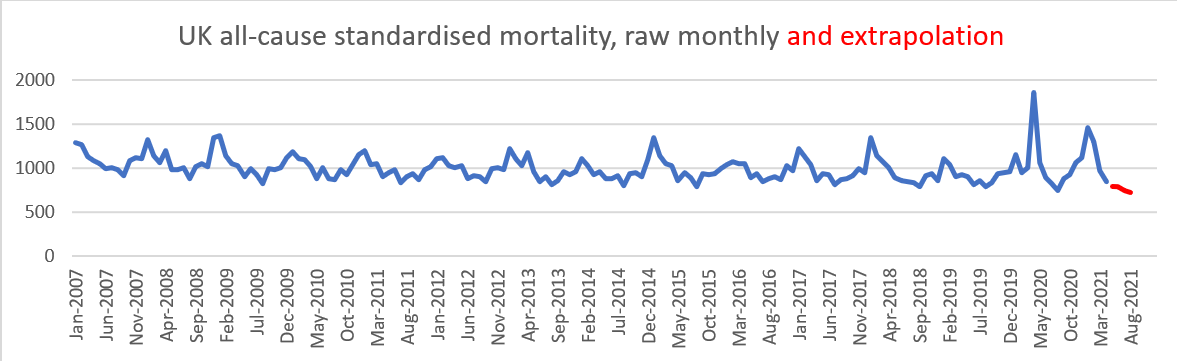
Here are the raw ASM figures from the above source.
The red line is based on extrapolated figures assuming that the depression of the monthly figures of 13% below the 5-year history continues from May to August 2021.
The mortality figures show significant spikes of short duration due to Covid peaks. But these peaks are also associated with significant lows, well below historical averages. For instance, the April 2021 mortality figure was 13% below a five year average for that month. This is an extraordinarily low figure. It suggests that the death rate, in April 2021, may well have been reduced because of some deaths in both the Spring of 2020 as well as the winter season of 2020/2021.
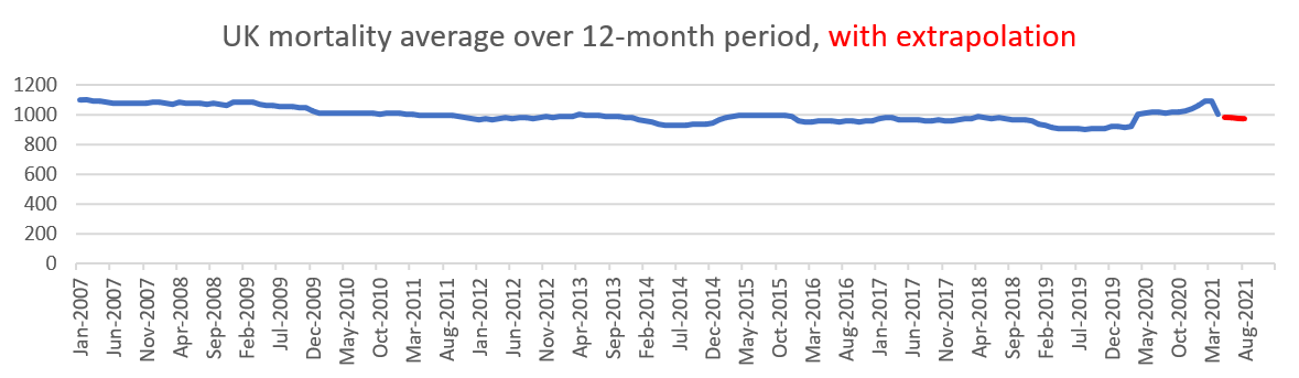
We can make more sense of the pattern of mortality by averaging it over a number of months, in this case over 3 months.
In this graph I have extrapolated assuming that the reduction in deaths in May-August 2021 is 9% below the 5 year previous figure average, a less optimistic extrapolation than the current rate of 13% down.
The 12-month averages are, of course, annual figures, shifting in starting point as we go along the x-axis.
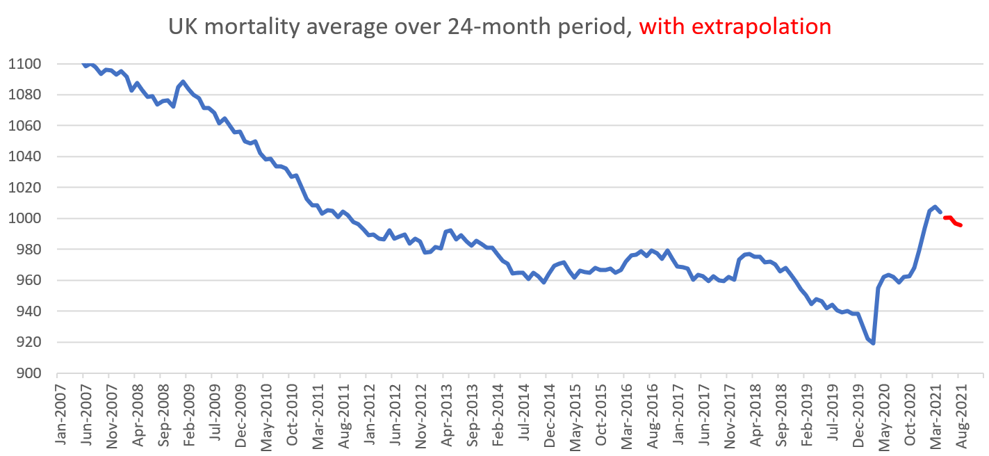
Again the ASM varies around 1000 per 100,000 but is noticeably stable. Mortality dropped in the years up to 2009. Since then it has remained fairly constant, averaging 988 per 100,000. More noticeable are the distinctly good years, 933 in 2014 and 907 in 2019, both of which years have increases in mortality in the subsequent years. There are good reasons to expect good years to be followed by bad years and vice versa. Two-year (24-month) mortality figures average these adjacent years, showing the overall trend.
Before we look at an amplified version of this graph, the first thing we should notice is its remarkable steadiness, hovering just under 1000 deaths per 100,000. Particularly noticeable is the unusual low in February-March 2020. There had been no significant respiratory deaths yet that winter and very few the previous year, leaving very many vulnerable people still alive.
This graph shows clearly the falling mortality before 2014, its remarkable steadiness from 2014 to 2018 at about 980 per 100,000, a sudden dip late in 2019 and then the rises already referred to.
To make any estimate of ‘deaths due to Covid’ one needs a good grasp of what should be regarded as ‘normal’. A figure of 975 from both the graph and the ASM figures is a reasonable guess at what might be an average and therefore ‘expected’ annual UK ASM.
In June 2020, at the end of the first Covid winter (containing the very mild first part of the winter season and the rapid rise due to covid), the ASM for that year was 1020 per 100,000, which is 45 per 100,000 above our average, representing an 30,600 extra deaths.
Using our extrapolation figure which expects deaths in May and June to be 9% below those for a previous 5-year period (whereas they are currently running 13% below) the 20-21 winter season will end in June 2021 with an annual mortality of 981, which is 6 per 100,000 more than recent averages. This corresponds to an extra 4080 deaths.
Putting these figures together, it seems that a realistic figure for the total number of Covid deaths over the two winter seasons, Jul 2019 – Jun 2021, have been about 35,000 for two years, an average of 17,000 extra deaths per year.
These figures show, as did the graph of 2-year average mortality, that despite the sad deaths of some, the actual effect of death rate from Covid has been very mild indeed. In a city like Preston or Bath, with 100,000 people, normally 975 would die every year. The effect of Covid over 2 winter seasons has been to increase the number of deaths by about 25 per year to 1000. 17 over 80’s, all but one with pre-existing conditions. 7 of age 60-79, all with pre-existing conditions. 1 person under 60 also with pre-existing conditions.
Electric fuel costs per mile Looking back to this post, small family cars, Renault Megane, Ford Focus, VW Golf, etc, do about 4 miles per kWh.
Electricity costs about 18p per kWh if you charge in the day, 10p per kWh for charging at night and quite a lot more if you charge away from home. I am going to use 12p per kWh for the average charging cost. If a car will travel 4 miles per kWh, that’s 3p per mile in electricity costs.
But when the weather is cold, the car uses much more, perhaps even twice as much because the battery has to heat the car as well as propel it through the air. That means that the electricity cost per mile is 6p.
I am going to use 5p per mile as a reasonable average figure for electricity cost.
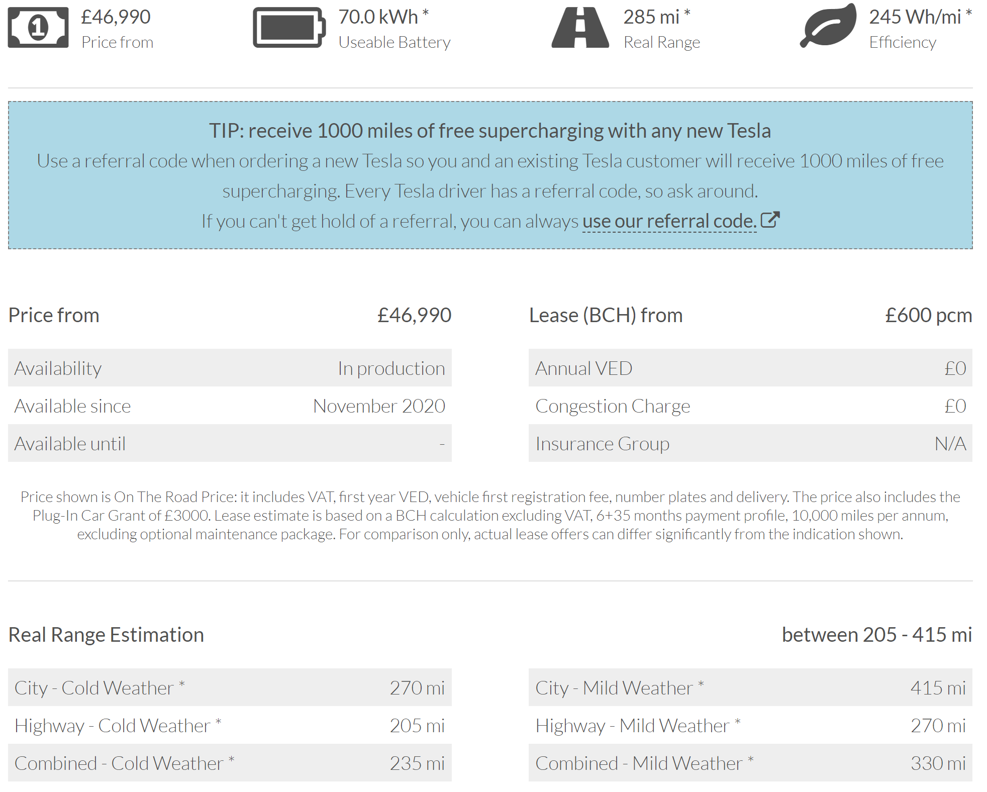
How large does an electric car batter need to be Here are the specifications of the current Tesla Model 3.
The useable battery capacity of a Tesla is 70 kWh. Bearing in mind the above figure, that a medium family car will do 4 miles per kWh, that 70 kWh will take the car 4 miles/kWh x 70 kWh = 280 miles. That is broadly comparable with the quoted figures, which show the range to be 215-415 miles.
Lifetime mileages Lifetime mileage for diesel cars is 130,000 miles (208,000 km). For petrol cars it is 100,000 miles (160,000 km). Let’s use a figure of 120,000 miles for a desired lifetime mileage of an electric car.
That’s 10,000 miles per year for 12 years, an average of 200 miles per week.
Number of charging cycles Let’s suppose that we charge the car twice a week, ie every 120 miles. That means we need to charge the car 1200 times in its life. That’s a reasonable figure. Elon Musk stated that the Tesla Model 3 battery has a minimum lifespan of 1,500 charge cycles. So it looks as though electric cars might broadly go far enough and the batteries last long enough.
Problems with electric batteries 1500 cycles seems fine. The problem is that the number of cycles depends on the extent to which you charge and discharge the battery. Batteries last longest if they are charged to 75% charge maximum and not discharged below 25%. It’s like saying that your car fuel tank will wear out rapidly if you fill it completely or let it get near empty. Effectively we only have 50% capacity with an electric car so this battery that might take you 400 miles in ideal conditions on a mild day really needs to be used in such a way that it will only take you 200 miles – and in non-ideal conditions on a cold day only 100 miles. That ain’t great.
Aging batteries If that isn’t enough, batteries age. A battery might last 1500 charge cycles but by that many cycles, the capacity and therefore range will typically be down to 70% of the initial range anyway. This means that an old battery, used in a way that will preserve its life, will only travel 70 miles. Fine for pootling around town but not great for visiting the family living 200 miles away.
The battery capacity we want If electric cars are to compete with petrol and diesel cars, they need capacities of four or five times as much. That’s quite a long way away.
The cost of replacing a car battery Battery manufacturers are coy about stating a price for a replacement battery. It’s a sign that the prices are horrendously high. The manufacturers shrug off questions about the cost of replacements, giving guarantees that batteries will serve for 80-100,000 miles, but only 8 years, saying that owners won’t need to replacement. One’s guess is that by the time the car is 8 years old it might be with the second or third owner, who won’t remember the original promises from the manufacturer.
The lower power batter of the Nissan Leaf is 40 kWh. Nissan apparently quotes £5000 for a replacement battery, plus fitting costs. The general feeling is that it will be regarded as uneconomic to fit a replacement battery to an 8-year-old car. After all, for less than £4000 you can get a whole replacement 8-year old car.
This Renault Megane is 8 years old with 72,000 miles on the clock has 5 or 6 years of life left in it. It has a range of over 450 miles and fuel costs of about 12p per mile. But the great thing is that there will be no sudden surprises of £5000 or more for a replacement battery.
In practice the 8-year guarantee of the battery means that Electric cars won’t last as long as internal combustion cars.
Fuel taxes on electric and petrol cars I’ve used the figure of 12p/kWh for the average charging cost of an electric car. If most of that charging is done at home, tax will have been levied on that at 5%. So the actual fuel cost is about 11.5 p per kWh, which is 3.8p/mile.
Fuel duty is 58p/litre on petrol or diesel. On top of that VAT is levied at 20%. With petrol at £1.20/litre (above its current price) that’s £1/litre before VAT. Since there is 58p fuel duty, the actual cost per litre is £1 – 58p = 42p/litre. If tax were the same for both electric and internal combustion cars, the fuel costs for this petrol Megane would be 4.5p/mile.
Depreciation, the capital costs of owning a car Here is a new Megane estate. Relatively cheap but a substantial and comfortable medium family car.
£18,000 brand new.
Suppose it lasts about the average 100,000 miles. That’s £18,000/100,000 which is 18p per mile in depreciation.
Compare it with an electrical rival.
The leaf, a smaller car with half the range, costs £23,000. It’s only as cheap as that because there is a government grant of £3000. The battery is only guaranteed for 80,000 miles. Will it need a replacement battery after 8 years at 10,000 miles a year? I’m going to guess that it will only last for 90,000 miles. I think that’s generous. Depreciation = £23,000/90,000 = 25.5p/mile (29p/mile without the subsidy).
Servicing costs A typical petrol car costs £400 per year to maintain. That’s £400/10000 = 4p/mile
Electric car cost can be expected to be 2/3 of that of a petrol car, say 2.5 p/mile
Overall running costs Type of car Electric Petrol Fuel costs 5p/mile 12p/mile Depreciation 25.5p/mile 18p/mile Servicing 2.5p/mile 4p/mile Totals 33p/mile 34p/mile
There really is very little difference in the running costs because petrol and diesel cars are taxed so heavily.
Running costs if both petrol and electric cars were taxed in the same way Type of car Electric Petrol Fuel costs 5p/mile 3.8p/mile Depreciation 29p/mile 18p/mile Servicing 2.5p/mile 4p/mile Totals 36.5p/mile 25.8p/mile
So with identical tax treatment, petrol cars cost about 2/3 of that of electric cars to run.
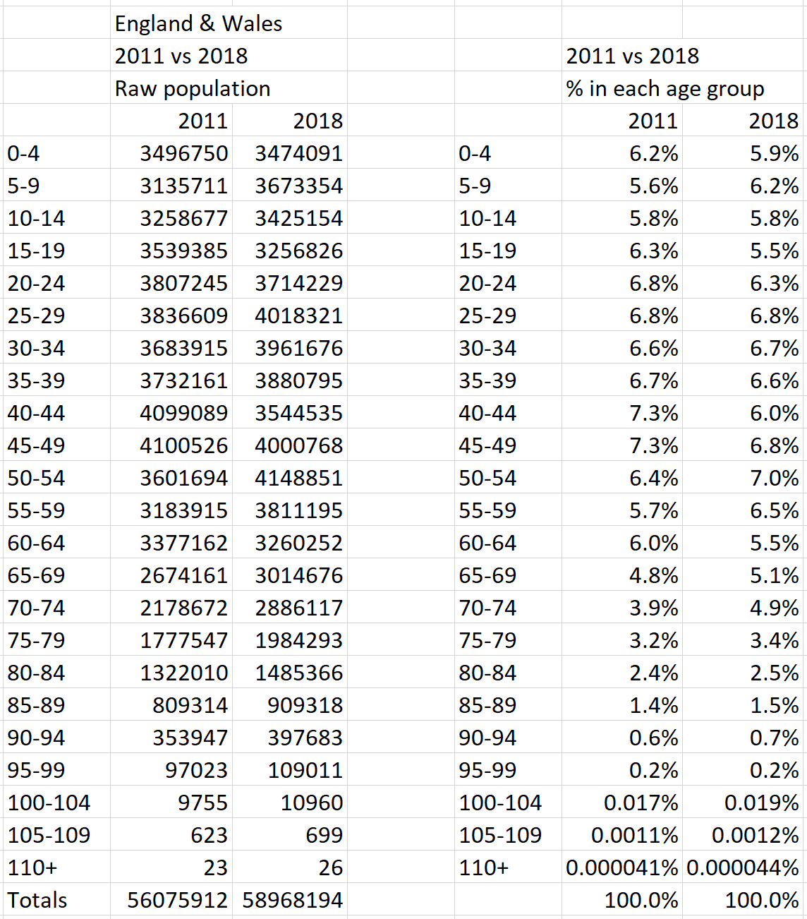
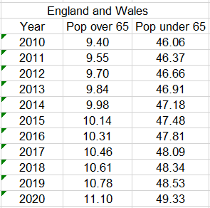
Any analysis of the mortality of covid depends on comparing the death rate with that of other years. A direct comparison is unfair because the population of 2020-2021 is larger than in earlier years and has a greater proportion of older people. This post produces age distribution date for the years 2010-2021, stating the sources and explaining the method by which the age distributions are calculated.
2011 census figures 2011 census has detailed figures of the Usual resident population by five-year age group for the whole of the UK and England and Wales figures alone.
These figures show that, in each age group, the population of Scotland and Northern Ireland are an average of 11.24% of the population of the whole of the UK, a figure comparable with that used in previous calculations of the England and Wales population compared with that of the UK as a whole.
2018 estimated population figures 2018 figures are projections calculated by ONS. These projections give projected numbers in 1-year wide age ranges, from which the five-year age groups can be calculated.
Filling in the over-80 figures The 2011 census lumps together all the over-80 figures. For the purposes of more detailed analysis, five-year age groups for over-80s have been constructed, distributing the 2011 figures for over-80s amongst the five-year age groups, assuming that the (reduced) number of over-80’s is distributed over the upper years in 2011 in the same way that the (larger) number of over-80’s in 2018 is distributed.
The above sources and calculations give us these figures:
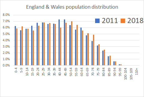
From this we get the following population distributions for 2011 and 2018.
Note how the columns for 2018 are distinctly taller than 2011 in the age group above 50 as the bulges in the 40-49 group have aged between those two years and moved from their fifties to their sixties.
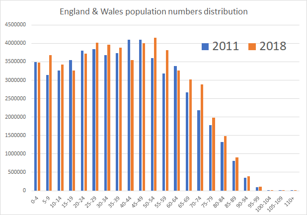
If we compare the population numbers in each age group between the two years 2011 and 2018, we see that the numbers over 65 are very significantly higher in 2018 because the effect already seen (an aging population) combines with an increasing population. Both of these effects lead to higher expected death rates.
What are the costs of dishwashing and the relative costs of machine vs hand dishwashing?
Hand washing A typical bowl has a capacity of approximately 12 litres when full. Suppose that one fills it to 10 litres and then, in the process of rinsing, replacing, topping up, etc, one uses twice that amount, ie 20 litres, which has a mass of 20 kg.
This water has to be bought and there is a charge for disposing of it. If both supply and sewerage are metered, these are in the order of £1.50 per cubic metre for both supply and sewerage, ie a total of £3 per cubic metre or £3/1000 = 0.3 p/litre. So the 20 litres of water cost 20 x 0.3p = 6p.
That water has to be heated, from an average temperature of 10°C to around 50°C. That is a rise of 40 K. (The kelvin, symbol K, is the unit of temperature difference, but you could, perfectly adequately, say that it was a rise of 40 °C.)
The energy needed to raise 20 kg of water by 40 K is 20 kg x 4200 J/kg K x 40 K = 3,360,000 joules = 3.36 megajoules (MJ). (4200 J/kg K is the specific heat capacity of water, the energy needed to raise the temperature of 1 kg of water by 1 K.)
The standard unit of energy supply is the kilowatt-hour (kWh), which is 3.6 MJ. So the energy needed to raise 20 kg of water to 50°C for washing up is 3.36/3.6 = 0.93 kWh.
If one heats the water by full-rate electricity, at 17 p/kWh, the heating of the water costs 0.93 x 17p = 15.8p.
If one heats the water by off-peak electricity at 10 p/kWh, the cost is 0.93 kWh x 10p/kWh = 9.3 p.
If one heats the water by gas, when gas costs 3 p per kWh, the cost of doing that depends on the efficiency of the water heating process. Typically gas water heating is 50% efficient, meaning that the heating actually costs 6 p per kWh. So for 0.93 kWh, the cost is 0.93 x 6p = 5.6p.
Washing up liquid A modest squirt of washing up liquid is about 8 g. If the washing up requires 4 squirts, that is a total of 32 g, about 32 ml.
Tesco Lemon washing up liquid (Aldi price match they say) costs 73p/litre. So 32 ml costs (32/1000) x 73p = 2.3p.
So hand washing our significant load of dishes costs: water supply and disposal – 6p heating the water – 9p (using the middle calculated value above) washing-up liquid – 5p (I’ve allowed for a number of extra squirts) Total – 20p/wash
Machine dishwashing Let’s compare this with using a dishwasher.
The Hotpoint HFE 1B19 has an energy rating of A+. It uses 12 litres of water per cycle and an energy consumption of 1.039 kWh.
The water costs are 12 litres x 0.3p/litre = 3.6p.
The energy costs for the water are 1.039 kWh x 17 p/kWh = 17.6p. This is significant more than that for the hand washing because, unless the dishwasher is run overnight, it heats the water on full-price electricity and neither on off-peak electricity, nor gas.
Tesco All-in-one lemon dishwasher tablets are £3 for 30 tablets, so 10p/tablet.
This Hotpoint dishwasher costs £270. If it does 1 wash per day for 5 years that’s 365 washes per year x 5 years = 1825 washes. The capital cost of the machine per wash is £270/1825 = 14 p/wash.
So the cost of machine dishwashing is:
water supply and disposal – 4p heating the water – 18p dishwasher tablet – 10p capital cost of machine – 14p Total – 46p
Our dishwasher may last more than 5 years with 1 wash per day. So perhaps the capital cost may be down to 10 p per wash. That brings the cost per dishwasher cycle down to 42 p. Our handwashing may actually use 4 bowls’-worth of water, doubling the cost to 40p. That makes cost per hand wash 40 p per wash, compared with the machine wash cost of 42p.
Even if most of the dishes are washed in the machine, there are usually some items that need hand washing. A comparison between hand washing and dishwashing needs to take into account that machine dishwashing is usually accompanied by some hand washing.
Conclusions There isn’t really much to choose between hand and machine dishwashing. They are of similar cost but the indications are that machine dishwashing is possibly somewhat more expensive. Dishwashing costs in the order of 40p per big load, perhaps 40p x 365 = £146 per year. Let’s call that £150 per year. Energy costs are about 40% of that, around £60 per year.
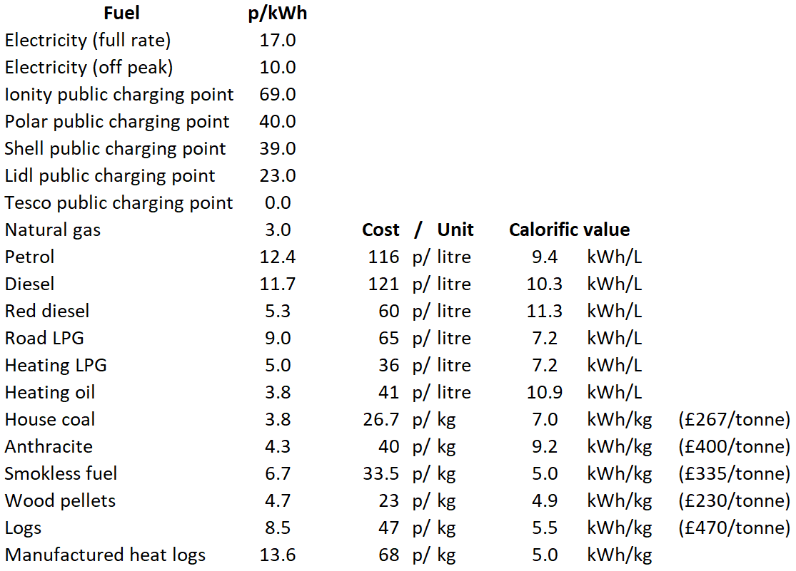
Before comparing running costs of different types of car, it is worth thinking about the cost of petrol and diesel compared with electricity and indeed other fuels. This post is the first part of a series. We begin by considering the raw costs of fuel. Next we consider the efficiency with which we can use those fuels, which affects the real costs of use. The third part looks how taxes affect the real costs.
Before making a comparison, it’s useful to remind ourselves of the units we are using. Lift an apple (100g) up a metre and you’ve done about a joule of work. Do that 3.6 million times and you’ve done 3,600,000 joules of work: that’s 1 kilowatt hour (kWh), the standard unit for supplying gas and electricity to the home.
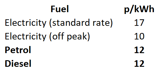
Here is a direct comparison of the costs to the consumer of electricity, petrol and diesel.
We are comparing all the fuels by the price per kilowatt-hour, even though we don’t buy petrol and diesel by the kilowatt-hour.
What is there to remark on? Perhaps that the different fuel costs per kWh are broadly similar and there is no obvious reason, from this information, leading us to think that electric cars should be cheap to run.
We buy petrol and diesel in litres rather than kWh and we know that diesel fuel is significantly more expensive than petrol. Yet the cost per kilowatt-hour for the two fuels is similar. It’s not hard to see that diesel fuel contains more energy per litre.
Let’s follow the numbers.
Petrol A litre of petrol has an energy content 9.4 kWh per litre and petrol currently costs 116.4p per litre. So the price per kWh is 116.4/9.4 = 12.4p per kWh.
Diesel A litre of diesel has an energy content of 10.3 kWh and costs 120.6p. So the price per kWh is 120.6/10.3 = 11.7p per kWh. We can see one reason why diesel cars cheaper to run than petrol cars: diesel, despite being 4% more expensive, is about 6% cheaper per kWh.
Electricity Buying electricity from the electricity supply at home, we pay about 17 p per kWh. Some electricity tariffs supply electricity more cheaply at night and charge a bit more per day (20p) and less (10p) for the 7 hours overnight, averaging the same 17p per kWh.
Public electric charging stations Electric cars are in their infancy. Charging at home is a recent step. But public charging stations are even more of an innovation. The prices of the services they provide will no doubt change over time but at the moment it can be much more expensive to charge your car from a station ‘on the road’. Ionity fast chargers charge 69p per kWh, with other providers charging more than twice what you would pay at home. If these costs become applied generally, electricity will certainly not be a cheap fuel. On the other hand Lidl charges 23p p/kWh at the moment, a reasonable mark-up for the cost of providing the service. Tesco is free but one can’t see that lasting.
You can stop here if you like The rest of this post is concerned with following the numbers through for a wide variety of fuels, not all of them for transport. I’ve put these figures here because I think it’s fun to collate all the fuel information and also so that later on I can branch off into considering domestic heating. You might like to have a quick look at the summary table a bit further down before departing.
Road LPG LPG stands for liquefied petroleum gas, It liquefies under modest pressures and so can be stored in tanks and used for domestic and commercial heating and for vehicle propulsion. LPG has an energy content of 7.2 kWh per litre and at a current price of about 65p per litre, that’s 65/7.2 = 9p per kWh.
Heating LPG Here we find our first consideration of the effect of tax on prices. LPG for heating has much less tax on it than LPG for transport. That brings its costs down to a typical 36 p per litre and with the energy stored being 7.2 kWh/litre, that equates to 36/7.2 = 5 p per kWh.
Red Diesel Red diesel is a tax-free version of road diesel, used for purposes like powering agricultural vehicles or heating. It is ordinary road diesel that has a red dye to colour it to check it is not used for taxable purposes. Red diesel has the same energy content as road diesel at 10.3 kWh per litre but the reduced tax means that it costs only about 60p per litre. So the price per kWh is 60/10.3 = 5.8p per kWh.
(Natural) Gas Gas costs about 3p per kWh at the moment. That’s because the oil price is very low due to the covid crisis. My own view, for reasons that I might address eventually, is that the ‘right’ price for gas is 5p per kWh.
Summary of fuel costs I’ve decided to summarise the fuel costs at this point before you get too bored with repeated calculations. The remaining calculations and some comments on the fuels follow the table.
Heating oil 10.85 kWh per litre and 41p per litre, which gives 41/10.85 = 3.8p per kWh.
Solid fuel House Coal is £267 per tonne (1000 kg) or 26.7p per kg. Its calorific value is about 7 kWh/kg. So the cost per kWh is 26.7/7 = 3.8p per kWh. Anthracite is 40p/kg with a calorific value of 9.2 kWh/kg, giving a cost of 40/9.2 = 4.34 p/kWh. Blaze Smokeless house fuel is 33.5 p/kg, with a calorific value of 5 kWh/kg giving a cost of 33.5/5 = 6.7 p/kWh. Like all fuels in which there is direct negotiation with the supplier, solid fuels prices depend on your ability to haggle and the time of the year at which you are buying. You can buy smokeless fuel for 28p/kg in the summer, much less than its winter price.
Wood pellets £265 for 1150 kg, which is 23p/kg. Calorific value around 4.9 kWh/kg, which gives 23/4.9 = 4.7 p/kWh. My own view is that wood pellets are not, in general, a renewable source of energy. Wood sawdust should be used to make materials like MDF (medium density fibreboard) which is used instead of wood in many products. Those who use them believing that the have some benefit in ‘saving the planet’ should think twice. Burning pellets of wood results in more living trees being cut down and therefore encourages the destruction of the natural environment.
Logs Kiln dried Ash logs, £350 for 750 kg = 47p/kg. Calorific value 5.5 kWh/kg, giving 47/5.5 = 8.5 p/kWh.
Manufactured heat logs Wickes; £6.50 for 9.5 kg, a pack of 12. That’s 68p/kg. There is no given figure for the calorific value of this product but the forest research reference below indicates that the calorific values of all woods is about 5 kWh/kg. So these Heat Logs cost 68/5 = 13.7 p/kWh. They are an expensive form of heating, particularly when we take into account efficiency in the next post on this subject.
Sources of information Figures for this post date from January 2020 http://www.monikie.org.uk/fuel-calorific-values.htm/ https://homefuelsdirect.co.uk/ https://www.nextgreencar.com/car-tax/fuel-duty/ https://www.directstoves.com/resources/guide-to-solid-fuels/ https://www.forestresearch.gov.uk/documents/1958/FR_BEC_Wood_as_Fuel_Technical_Supplement_2010.pdf https://www.whatcar.com/news/electric-vehicle-charging-%E2%80%93-what-does-it-really-cost/n16833 https://www.thisismoney.co.uk/money/cars/article-8046323/Charging-electric-car-using-public-chargers-cost-10-TIMES-home.html
This poem, about Elgar, is a memory from childhood. It’s quirky and amusing.
I’ve googled it, etc, with no luck. So I stick it here wondering if a search engine will pick it up and a fellow seeker will find that he isn’t a lone seeker.
Try to imagine if you can That Elgar was a handyman, And when not writing tunes and airs Was very fond of making chairs, And he derived such merriment From chemical experiment.
Another thing you’d often see Was Elgar chopping down a tree, And once he made a double bass Out of an ancient packing case. I think this fact sticks out a mile: Elgar was very versatile.
Summary It goes against our nature to be told there is nothing one can do about something but sometimes logic drives us to that conclusion. Energy saving heating controls are sometimes like that. Some controls are worthwhile: others are not. Despite apparently well-qualified sources saying the contrary, if one has a modern hot water cylinder heated by oil or gas, it saves almost no energy to have the hot water timed, rather than have it turned on continuously.
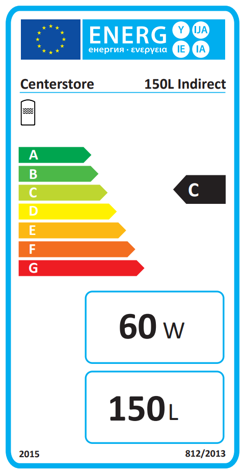
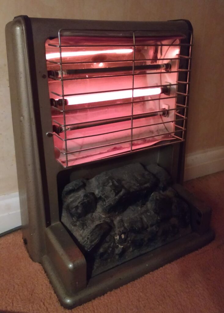
Analysis Here is the energy label from typical recent hot water cylinder.
This label shows that the cylinder has a volume of 150 litres and loses heat at the rate of 60 watts (60 joules per second).
Calculating the energy loss Losing energy at 60 joules per second means 60 x 3600 = 216,000 J per hour. Overnight (from 10 pm to 6 am) or during the day (from 8am to 4 pm) are 8-hour stretchs, so during that time the total energy loss is 8 x 216,000 joules = 1,728,000 joules = 1.78 MJ. That’s 1.78/3.6 kWh, about half a kilowatt hour, ie about 3 p if you heat your hot water by gas.
So, every morning, or every evening, if the hot water has been turned off for 8 hours, the boiler uses 3 p worth of fuel just to top up the losses during the day. That’s 6 p per day, or £22 per year. Is there the possibility of saving some of that energy wasted?
As the tank loses energy it cools down The tank contents are 150 litres (150 kg) of water. We can calculate how much its temperature falls. Energy = mass x specific heat capacity x temperature change. 1,728,000 joules = 150 kg x 4200 J/kg K x temperature change temperature change = (1,728,000)/(150 x 4200) = 2.74 °C (Physicists label that 2.47 K)
If the hot water is turned off, the temperature drops a small amount. If your controls turn the hot water off for an 8-hour period, your hot water drops in temperature by about 3 °C, say from a set temperature of 65 °C down to 62 °C. That means its average temperature is 63.5 °C. The first effect of the heating system when the time turns the hot water system back on is to heat the water back up to 65 °C. That’s where the 3 p worth of energy is used.
If the hot water is left on, the temperature doesn’t fall If you leave your heating switched on, the hot water stays at 65 °C. Whenever the thermostat senses that the temperature dropping, it turns the heating system on to top it back up. So instead of having to reheat the water when the system turns back on, it is continually topping up the energy loss – by an amount pretty much the same as the 3-p-worth which it needs if it switches the hot water off.
But surely you save some energy by turning off? If you keep the hot water on, it is at a steady 65 °C, that is steadily 45 °C above the 20 °C surrounding room. If your controls turn the hot water off for an 8-hour period, the tank temperature drops from 65 °C down to 62 °C, an average of 43.5 °C above the surroundings. This is not very different from leaving the hot water on and therefore the heat loss is pretty similar.
If, when switched off, the temperature above the surroundings has dropped in the proportion 43.5/45 compared with leaving the hot water turned on. The energy loss, and the cost of the energy loss, has dropped in the same proportions.
So the heat losses during switched-off times go from £22 a year to = £22 x 43.5/45 = £21.27 a year. That means that the reheating costs drop by 83p a year.
If you have oil or gas central heating and you control your hot water heating and turn it off for periods during the day, you might save £1 a year, a trivial saving against the convenience of hot water at any time or the simplifications of your heating control system.
In fact the savings are even less So far we’ve assumed that all the ‘losses’ from the hot water cylinder are waste. This is not always the case. At times of year when a house is being heated, energy ‘lost’ from the boiler is useful in heating the house. If the house is being heated by gas, a 60 W loss from the hot water tank is worth as much as about a 20 W heating from the gas boiler during the heating season, so the potential savings of switching off drop to about 70p a year. If you are heating by on-peak electricity, the 60 W ‘lost’ is just as good as 60 W produced by your electrical heating, so the savings are about 42 p per year.
What about longer periods of switch-off If you are away for a whole 24-hour day, that’s three times as long as the 8-hour periods we’ve considered. If you turned the heating off for that day away, the hot water temperature would drop by about 3 x 2.47 K, = 7.4 K, ie down from 65 °C to 57.6 °C, an average temperature of 61.3 °C, ie 41.3 K above the surroundings. This would take the heat loss down to 8.3p. So you can save 0.7 p by turning off the heating if you are aware for a day. Only if you are away for several days during which the tank temperature will drop very significantly, is it worth turning the hot water off. If you turn the tank off when you are away for a week, you will save about 60p. With the average household away for less than 4 weeks a year, turning off hot water when one is away can save at the most a couple of pounds a year.
If you have a combi boiler Most combi boilers heat hot water on demand. With them there is no stored hot water and no ability to turn the hot water off. Some combi boilers have a small reservoir of water that is always kept hot so that the boiler delivers hot water even more quickly. One can save a small amount of energy by turning this pre-heat system off but manufacturers do not recommend it because the savings are small.
The only time is is worth controlling hot water heating If you have off-peak water heating it is worth controlling the hot water heating. In that situation it makes sense to make sure that the heating of the hot water is done during the night. Let’s run the calculations.
In a flat occupied by 2 people, hot water consumption might be 100 litres (100 kg) of water per day. This water has to be heated from an average temperature of 10 °C to, 65 °C, an increase of 55 kelvin. The energy needed to heat this water is mass x specific heat capacity x temperature rise = 100 kg x 4200 joule/kg K x 45 K = 18.9 MJ = 18.9/3.6 = 5.25 kWh.
Heating this by on-peak electricity at 14.9p per kWh costs 14.9 x 5.25 = 78 p per day.
Heating this by off-peak electricity at 9.3 p per kWh costs 9.3 x 5.25 = 49 p per day.
So you can save 29 p per day, ie £106 per year, by using off-peak electricity.
Under those circumstances only is it worth controlling the time at which you heat the water.
Topping-up electrically heated hot water Many electrically heated hot-water systems have a top-up facility by which one can turn an immersion heater on if one runs out of off-peak-heated water.
If one needs the top-up regularly, then certainly one is using more than 100 litres per day and there is value in considering a larger tank. There are savings in the order of £200 per year if one heats 200 litres of water a day with off-peak electricity rather than with on-peak.
On the other hand, if one tops up rarely, the easiest thing to do is to set the overnight heater to a high temperature and the top-heater to a lower temperature. It will rarely turn itself on and the cost of having hot water always available will be less than £10 a year if one found that one was turning the on-peak heater on less often than once a week.
There are exceptions to this analysis. If one wears hair shirts and likes to be nagged into reduced water consumption, rely on the overnight hot water running out and giving you the occasional cold shower so that you have less time in the shower and take pleasure in using less hot water and less energy.
In practice there are a number of confusing factors to this analysis. Experience shows that those households in which saving energy is a high priority are also those with drench showers that use most water…
Other reasons for switching the hot water off at night. Sometimes the most numerate don’t like the feeling that there is nothing that one can do to effect a significant saving and they want to control the water heating whatever. Sometimes there is a light sleeper in the house disturbed by the noise of the hot water system…
Surely there is something you can do? Modern hot water cylinders are much more effectively insulated. If your hot water cylinder is old, and by that I mean perhaps as little as 10 years old because insulation standards have increased rapidly in the last decade, it is worth considering a new hot water cylinder.
Hot water cylinder swap worthwhile? Heat your hot water cylinder fully and measure the hot water temperature (say at the tap with a cooking thermometer). Then turn off its heating completely and measure the hot water temperature after 8 hours. If the temperature falls by less than 5 °C in eight hours your cylinder is well-enough insulated. The greater fall than this, the more worthwhile it is swapping the cylinder. If the temperature falls by 20 °C in 8 hours, you’ll save well over a hundred pounds a year by upgrading to a modern hot water cylinder.
The green serenity prayer As always it makes sense to change the things that matter, accept the things that don’t and have the wisdom to know the difference.
Small electric cars Carwow recently tested 6 small electric cars. They were able to travel between 3.7 and 5.2 miles per kWh and had ranges between 113 and 229 miles. That’s a factor of 2 in the range but the battery sizes varied from 28.5 kWh to 52 kWh. Roughly, if you have twice the battery size, you can go twice as far. The best was the Renault Zoe which, with the 52 kWh battery, has a mass of about 1500 kg, or a ton and a half.
Larger electric cars A Tesla Model S has a mass of 2350 kg (2.3 tonnes) with the largest (100 kWh) battery. Its range is claimed to be 315 miles. So the Model S is able to travel 315 miles/100 kWh = 3.15 miles per kWh.
Thought Why do larger electric cars, with larger range, do fewer miles per kWh? The answer is simple. If you have a larger battery it’s much heavier (technically a larger mass). The Renault Zoe 52 kWh battery has a weight of 326 kg. The Tesla S 100 kWh battery has a weight of 625 kg, roughly twice that of the Renault Zoe for twice the capacity. If the battery has a larger mass then the whole car needs to have a larger mass because it needs to have larger motors to accelerate that mass, larger brakes to slow the mass down, stronger structures to support the mass, etc.
The biggest electric fuel tank on the market So far as I am aware, the 100 kWh battery of the Tesla model S is the biggest car electrical fuel tank on the market. It has a capacity of 100 kWh.
Comparing electric car figures with a modern diesel car Let’s compare the Tesla battery with the modest 47 litre fuel tank from my own medium-sized Renault Megane. Diesel fuel has energy of 10 kWh per litre. So the the 47 litre tank has an energy capacity of 470 kWh. That sounds great until you realise that the efficiency of a diesel engine is about 30% compared with the near 100% efficiency of electrical motors. So let’s multiply by 30% (0.3) to work out the effective capacity of the Renault Megane fuel tank. 30% x 470 kWh = 141 kWh. Gosh, that’s interesting. A medium-sized diesel car has nearly 50% more energy capacity than the largest electric car. Moreover, since diesel has a density of about 0.8 kg per litre, the mass of the diesel tank plus the fuel will be about 47 kg for its energy capacity of 141 kWh, compared with the Tesla battery’s mass of 625 kg for an energy capacity of 100 kWh. Diesel tank: 3 kWh/kg. Electric battery: 0.16 kWh/kg. The diesel fuel tank stores nearly 20 times as much per kilogram than the electric battery. In fact, for reasons I may tackle on a later post, the difference is even bigger than this.
Diesel car fuel consumption The 2016 Renault Megane diesel is quiet, comfortable and has good economy figures. It has a mass of 1500 kg, about the same smaller electric Zoe. (The Zoe’s mass is larger because the battery has a large mass.) Over around 8364 miles of mostly long-distance driving, it averaged 56 mpg with an average speed of about 30 mph. That’s a slower speed, and more accelerating and braking than the cars in the Carwow test. 8364 miles at 56 mpg is 8364/56 = 149.4 gallons for those 8364 miles. Since there are 4.55 litres per gallon, that is 149.4 x 4.55 = 680 litre. Each litre has 10 kWh of energy but diesel engines are only 30 % efficient, so we get 3 kWh of useful work out of each litre of diesel. Total amount of useful work out = 3 kWh/litre x 680 litres = 2040 kWh for 8364 miles. So energy needed per mile = 8364 miles/2040 kWh = 4.1 miles/kWh. So we can see that the medium-sized Renault Megane travels as many miles per available kWh as a typical small electric car.
Broad facts worth remembering. A small car will travel about 5 miles per kWh. A large car will travel about 3 miles per kWh. Medium cars, as you might imagine, are somewhere in the middle. If you want to travel 300 miles in a large car, you need 100 kWh. That is as simple as that. A 50 kWh battery, powering a small car which does 5 miles/kWh, will give a range of 50 kWh x 5 miles/kWh = 250 miles, but there isn’t yet a small electrical car that will do that: the Renault Zoe, travelling at a constant speed along a motorway, only did 229 miles.
Other tests on the Megane I did two trial runs on quiet motorways to measure fuel consumption at fixed speeds. At 48 mph I averaged 72 mpg. At 58 mph I averaged 58 mpg. These figures point to the reasonableness of the overall 56 mpg figure experienced in practice.
What if coronavirus, Creeps around unstoppably, In aerosols too fine for masks to impede And, like many a disease before it, Is already so widespread That, despite all our efforts, It will take its toll Whatever we do?
What if our many billions, Poured out in lockdown With no regard for wiser means, Have had not the slightest effect, Save for an impoverishment That leads us to borrow more From nations who hold in contempt All we once regarded as dear?
What if men and women, Entranced by man’s achievements, With ne’er a thought for God, Have grown oblivious to the powers of nature, And, having been told so often That we have rights to all and sundry, Forget that the source is not government fiat But fair winds and the sweat of man’s brow?
What if we are governed By a godlessness That, unlike the real Canute, Knows not the limits of man’s power But assures us that viruses can be beaten And, were it politically expedient, Would equally tell us That the sea could be held back?
Canute the Great was king of Denmark, England and Norway. He was one of the first Scandinavian kings to accept Christianity. Medieval historian Norman Cantor called ‘the most effective king in Anglo-Saxon history‘, which corelates with the story of him demonstrating to his flattering courtiers that he had no power over the waves.
The story reminds one of Psalm 2:
Why do the nations conspire and the peoples plot in vain? The kings of the earth rise up and the rulers band together against the Lord and against his anointed, saying, “Let us break their chains and throw off their shackles.”
The One enthroned in heaven laughs; the Lord scoffs at them. He rebukes them in his anger and terrifies them in his wrath, saying, “I have installed my king on Zion, my holy mountain.”
I will proclaim the Lord’s decree:
He said to me, “You are my son; today I have become your father. Ask me, and I will make the nations your inheritance, the ends of the earth your possession. You will break them with a rod of iron; you will dash them to pieces like pottery.”
Therefore, you kings, be wise; be warned, you rulers of the earth. Serve the Lord with fear and celebrate his rule with trembling. Kiss his son, or he will be angry and your way will lead to your destruction, for his wrath can flare up in a moment. Blessed are all who take refuge in him.
A fast mechanical hard drive, connected by a USB 3.0 connection to a laptop, conveys data at around 90 MB/s. Multiplying by 60 that’s 5400 MB/minute, ie around 200 minutes for 1 TB.
It is reasonable (at least in 2020) to say that man can survive on 1 TB, unless one is actively engaged in copious video editing, hence the many online storage systems that offer 1 TB as the entry level. If one does a complete backup monthly, not a daft thing to do, that means hanging around for 200 minutes, ie 3 or 4 hours, for a backup every month.
A fast 1TB USB solid state disk will operate many times faster than a mechanical hard drive. This one, from Sandisk, costs £150 and promises 1000 MB/s. In practice a typical laptop USB port will limit that to 400 MB/s. This is still five times as fast as a mechanical hard drive. It means completing a full backup in half an hour.
So moving from mechanical hard disks to fast solid-state-disks can save a couple of hours hanging around time per month.
If one regards one’s labour, or one’s free time, as worth as little as £5 per hour, swapping from a mechanical hard drive to SSD could save one 2 hours of hanging around per month, £10 per month, £120 per year…not far of the price of the fast SSD saved in a year. If one is in a commercial environment, the time value of money means that it is even more worthwhile to make the move to solid state storage.
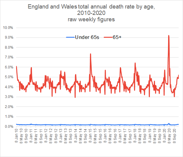
Covid-19 has affected death rates in obvious ways: it has been a direct cause of death; it has occurred alongside other illnesses, resulting in some earlier deaths as a consequence; its disruptive presence throughout the health service has resulted in early deaths for some who have been denied life-saving treatment, or have been reluctant to seek treatment, for other conditions. As 2020 comes to a close, we can see the overall effect of covid over getting on for a whole year and its overall impact on the death rate for England and Wales.
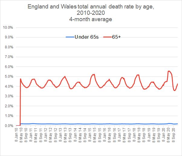
This graph shows the erratic nature of the weekly death figures. There are big spikes down at Christmas (and other holidays) when deaths are reported late and up just after New Year when the deaths over Christmas are added in. But this graph already shows some interesting figures.
The death rate for over 65s is about 4%. That means that 1 in 25 over-65s die within a year on average. But since there are about 11 million people over 65, that is about 440,000 over-65s deaths per year.
The death rate for under-65s is about 0.2%. We can see that that it has varied little as a result of covid. On average 1 in 500 under 65s die every year. And since there are nearly 50 million under-65s, that means that there are about 100,000 under-65s deaths per year.
The average total death rate for England and Wales is the 440,000 over-65s plus the 100,000 under-65s, giving a total annual death rate of about 540,000.
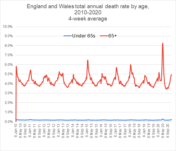
If we average the weekly death rate over a 4-week period, we see more of the underlying pattern.
This shows that the death rate for over 65s varies quite a lot over the year, hitting a peak sometimes over 6% in the winter, dropping to below 4% in summer. This year we had a very high peak of over 8% in March but that was followed by particularly low death rate in August. Some of those who died in the April covid peak did not live to die at their expected time of August. This provokes the question as to what extent the reduced deaths of August compensated for the increased deaths in May. To find out the extent of this balance, we average over a longer period of 4 months.
The 4-month average shows that 2020 is only a slightly unusual year. For the over-65s, the death rate rose to a high of 5.6%, while falling to an unusual low of 3.6% in September.
Certainly covid was instrumental in the particularly high death rate in April but there was another contributory factor: winter 2018-19 was a year in which there were relatively few flu deaths. This means that the vulnerable who would normally have died in that winter were still around in the peak of the 2019-20 season and among those who succumbed to covid.
We still see the particularly low death rate of 3.6% in September, a consequence of the vulnerable dying in April and not being around to contribute to the September statistics.
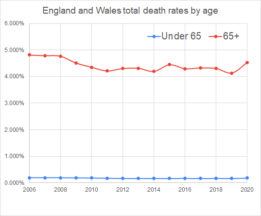
Monthly figures are not available for years before 2010. But whole year figures are available from 2006 and are shown here.
As can be seen, the 2020 death rate is entirely normal in the historical context, having an overall death rate for over 65s of 4.5%, slightly more than the peak of 4.4% in 2015 but less than the 4.8% figures from 2006 to 2008
Calculating total excess deaths On the basis of previous years we predict how many deaths we would expect in a given year and compare it with the actual number of deaths. These figures we have been dealing with enable us to make a prediction for death rates for 2020.
If we confine our calculations to the recent low death-rate years, the average death rates for under-65s from 2013 week 52 to 2019 week 51 are as follows: Under-65s – 0.169% Over-65s – 4.321%
Using the figures below for the numbers in the two cohorts, this gives predicted deaths for 2020 of Under-65s – 83,376 Over-65s – 459,545 Total – 562,922 (The extra 1 being a consequence of rounding issues.)
In fact the total deaths in England and Wales for 52 weeks from 2019 week 52 to 2020 week 51 has been 600,058. This is an excess death figure of 37,136. However, if we compare 2020 with 2006-8, we find that 2020 has had 27,491 fewer deaths pro rata than these years.
Even if the excess mortality in 2020 is close to 37,000, that includes deaths from all causes, including the knock-on excess deaths from all other diseases where treatment has been disrupted by attention to covid. (Many of us know perhaps more individuals who have had life-saving treatment disrupted than individuals who have died of covid.)
Bearing in mind that there have been suggestions that excess deaths for cancer may be, at a minimum, in the order of 10,000, it seems likely that the excess deaths due to covid will be well under 30,000. This is in stark contrast to the figure published for covid deaths in England and Wales of 65,795 (as on 31/12/2020).
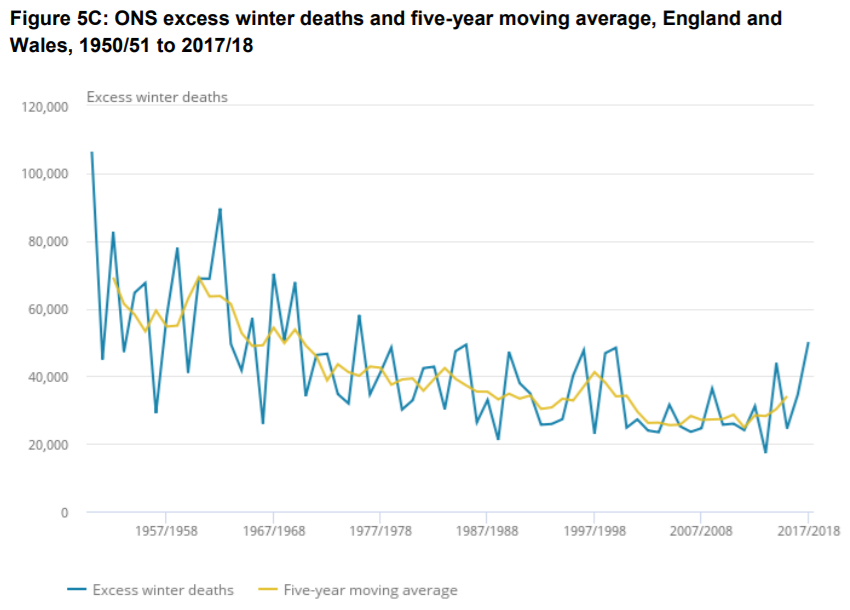
As can be seen from the graph below about excess winter deaths, seasonal deaths commonly vary by over 20,000 from one year to another. In which case, even were the 37,000 excess deaths this year all due to covid, that would not be far out from the range of swings that habitually occur from year to year – see the graph below.
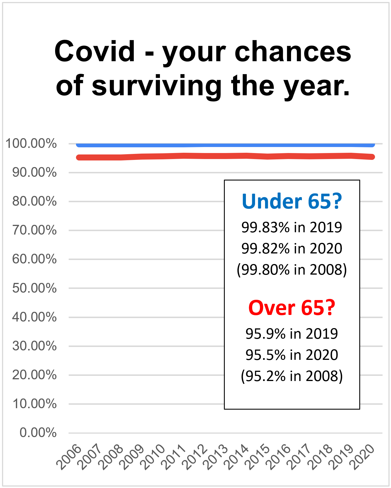
Survivability – the chance of surviving the year So far we have calculated in terms of death rates, the chance of dying in a year. But a different, and possibly more relevant, perspective is to consider the chance of surviving the year, a more useful way of seeing the impact of covid on our lives.
For those of us over 65, over the 6 years from 2013 to 2019, the death rate was 4.3%, meaning that our chance of survival was 95.7%. 2019 was a particularly good year in which survivability of over-65s was 95.9%. In 2020, with a death rate of 4.5%, survival rate has been 95.5%.
Here we can see how survivability has changed over the last fifteen years.
With over-65s survival rate consistently a little above 95% we can see that the effect of covid has been really very small. We can stop worrying and regard 2020 as a normal year.
Since first publishing this, the Office for National Statistics has crunched the figures. Their figures are for the 12 months to the end of November 2020. Here is the graph for age-standardised-mortality.
As you can see, this graph is pretty much identical in shape to my own graph on death rates above. Again it shows that 2020 is not a particularly exceptional year.
The BBC, in their publication of the ONS statistics, were very naughty. They focused on the excess deaths in 2020 being greater than any other year since the Second World War. Well, since the population (at 68 million compared with 47 million during WW2) and the proportion of over-65s (18% as opposed to 10%) are greater in 2020 in any other year, of course we should expect the death rates to be greater.
Statistical notes These figures are produced by taking the ONS published weekly death rate figures, multiplying them by 52 to give an annual death rate figure and dividing them by the numbers in the two cohorts (0-64 and 65+).
Numbers in the two cohorts are calculated from published UK population figures, reduced by 11.3% decreasing to 11.0% from 2010 to 2020 to account for those in Scotland and Northern Ireland.
Percentage of over-65s in the UK population is derived from the sources below, interpolating between fixed point data where necessary. Here are the figures used.
For a long time I was a believer in a single, well-checked bank account. I realised now that I’d never checked most of my spending. I had a rough idea how much it was because I noticed whenever I took out £100 or so from the bank and how long it had been since I last withdrew cash. At any instant I could see how much cash I’d spent by how much was left in my wallet. But I never checked small amounts like the 49p for cable clips, or the £1.50 for a pasty, because I never checked individual receipts for cash payments.
I always had a rough idea how much cash I spent which I checked by matching 4 or 5 cash withdrawal slips with the bank statement, at the same time checking the dozen or so big items which were not cash, and my total cash spending from the cash withdrawal
Then the world changed as the number of card payments from my ‘single, well-checked bank account’ steadily rose. Come bank statement checking time, I found it was a nightmare with so many bits of paper. The big items were being disguised by a large number of small items, like 49p for some cable clips or £1.50 for a pasty. Bank account checking, which had been easy, became difficult. That coincided with a suggestion from a family member that multiple bank accounts were worth considering and eventually I was converted. I now have four main bank accounts:
Income Bills Savings Day-to-day
Income account All my income goes into my Income account. From that account there are three standing orders to my other three accounts. It takes seconds to check my Income account statement because just my income goes in and three standing orders come out.
Bills account I have a Bills spreadsheet (Google docs) which lists all my regular bills, including estimated amounts for things that I know will happen. It’s something like this:
The spreadsheet tells me that my regular bills are something around £650 a month and there is a standing order from my Income account to my Bills account of £700 a month. It’s easy to check my Bills account because there is the single income from my Income account and a number of payments, all of which I am expecting and included on the spreadsheet. As the years go on, I add more and more things to the Bills spreadsheet which gradually gets clearer as a predictor of the regular outgoings.
Savings account There is a standing order from my Income account straight into my Savings account, of an amount I have decided to save every month. (In fact there is another standing order into the Savings account of £150, the car replacement cost and the family holiday cost. Those amounts, too, accumulate in my savings account and, come new car time and holiday time, those bills are paid from my savings account.) Checking my savings account is easy. There are the two standing orders, one from Income and one from Bills, and that’s it until I spend on holiday or car.
Day-to-day The third payment from my Income account is to the Day-to-day account. From that I pay food, car fuel, meals out, any hobby expenditure, paint for the house, furniture, books, magazines, Amazon expenditure, Ebay, optician charges…plus cable clips and pasties. In other words, all the other expenditure. My credit card comes out of this account as well. So all my expenditure is summarised by the Bills account or the Day-to-day account, through which all my expenditure is paid. My day-to-day account is a Starling account, though Monzo is just as good. Starling is an electronic banking account that is very easy to use and check. It is my wallet and gets filled up by the standing order at the beginning of the month. At any stage of the month I can look at it and see how much I have spent and how much I have left. Do I check the Day-to-day account? No I don’t. It’s like I used to treat my wallet. I only look at the totals. But it’s better than my wallet because I can look back at the expenditure over the month and instantly see the patterns in my expenditure. Starling provides me with monthly summaries categorising my expenditure as well as the detail if I want it.
The consequence of all the above is that I check Income, Bills and Saving monthly. But it only takes seconds, because they are so easy to check. I check Day-to-day quite often but briefly, seeing how long it is until the end of the month and how much I have left. As for the nightmare of monthly checking of my bank statements, that has gone completely. Life is so much easier and clearer. Is this OCD? Possibly. But actually it is appropriate OCD. Appropriate OCD makes life easier, reducing the time doing things that one doesn’t want to do, leaving more time for the things that one does want to do.
Other accounts For a while, bank accounts have been free. So, if a different type of expenditure arises, it’s been easy to have another account for that expenditure. Even where there is a charge (Starling charges £2 a month for extra accounts) it can be worth having additional accounts if you can’t get a free one from a different bank. House renovations: get a house renovation account. Pay for everything with a card from that account and instantly you can see how much has been spent on the whole project. If it’s easier, and to avoid confusion, it’s possible to have separate car and holiday accounts to keep them separate from general savings. Husband and wife ‘pocket money’, separate from general household expenditure, can also go in separate accounts. Other forms of income – share dividends, self-employed work etc – can also each have their own account. That way, come tax return time, all the information is in one account.
Here is a very rough comparison of the costs of mains and 18V power tools. The comparisons are between Einhell, Makita, deWalt, Milwaukee and Bosch. The comparisons are rough and ready, using the cheapest available items in each category in Screwfix, Toolstation and Wickes online as sources for the prices. There was no attempt to match specifications, for instance by ensuring that all were brushless, etc. Milwaukee corded tools are not included because they do not seem to be generally.
Don’t compare directly the Total, excluding battery, column for corded and cordless, because the former does not have an impact driver included. The brands are in price order with Einhell by far the cheapest and Bosch most expensive.
Thoughts: 1. There is not an awful lot of difference between the main brands, particularly since I noticed that the Bosch cordless tools are particularly highly specified, which accounts for some of the price premium over the others. A friend whose judgement I trust says that the Milwaukee quality is better than Makita. 2. The cordless premium is calculated by subtracting the corded prices in the corded column from those in the cordless. As can be seen, the cordless premium is relatively low (around 10% when one takes into account the previously mentioned high specifications of Bosch cordless). So, once one has the batteries and charger, one might as well go cordless. 3. All brands have one or two cheap offers which bundle a couple of batteries and a charger, making the transition to cordless less than the prices above indicate. 4. Makita LXT was launched in 2005 and is still their major brand. So the technology is mature and obsolescence of currently purchased tools unlikely to be a problem. 5. Makita is a market leader and it may be that its ubiquity stimulates competition which tends to drive the price down.
Other random thoughts Mainstream manufacturers are also producing 10.8 V or 12 V tools in addition to 18 V. I suppose that ‘small and light’ must be the aim. At the same time there is a tendency to move to higher voltages for beefier tools, sometimes double 18 V and sometimes treble. So the battery market seems to be getting more diverse rather than more standardised.
…and the business of transporting manufactured goods across the world.
Seeing this video of the container ship Maersk Essex, I couldn’t resist trying to count how many containers she seemed to be carrying.
At the rear we see the stack is 19 containers wide and probably 10 containers high (guessing on how deep they go into the body of the ship) and it seems that the ship is about 20 containers long. That’s 19 x 10 x 20 = 3800 containers altogether. These containers are 40 ft long, twice the standard unit for calculating container loads, which is the TEU (Twenty-foot Equivalent Unit), so our calculation would seem to show that the capacity of the ship is 7600 TEU.
In fact our calculation is a significant underestimate. As this photo shows, containers are stacked well inside the hull of container ships.
The website marinetraffic.com gives more details of the MAERSK ESSEX. She was was built in 2011 and is sailing under the flag of Denmark. Her carrying capacity is 13,100 TEU and her current draught is reported to be 12.5 meters. Her length overall (LOA) is 366.44 meters and her width is 48.26 meters. At the time that I am writing, 24 November 2020, marinetraffic.com says she is on her way from Los Angeles and due to arrive at Yokohama on 2 December.
Consider the Maersk Essex to be fully loaded. That’s 366 x 48 x 12.5 m³ = 220,000 cubic metres and since each cubic metre of water has a mass of 1 metric tonne (1t), the total mass of water displaced is 220,000 t.
In fact the ship is not uniform and rectangular so in this case we have overestimated the displacement. In fact her Gross Tonnage is 141,000t.
Panamax and New Panamax ships
The Maersk Essex is an interesting size. She is just within the size for the new, wider, deeper Panama canal, which opened in 2016. The new canal sections increased the size of ships from 5000 TEU to 13,000 TEU, these sizes of ship being referred to as Panamax and New Panamax respectively.
There are significantly larger container ships. The HMM Algeciras built in 2020 is 400 m long and 61 m wide. It has a gross tonnage of 228,283t and a container capacity of 23,964 TEU. Ships like this which are larger than will fit through the Panama Canal are called post-Panamax or super-Panamax.
Suez canal
The Suez Canal now allows ships up to 400 m long with a beam of 50 m and a draft of 20.1 m. This is larger than New Panamax, leading to a maximum ship size of 160,000 tonnes, and a container load of around 14,500 TEU. In fact the Suez Canal has no locks and so there is no engineering limit on ship length, despite the regulation limit of 400 m.
Other pinch points around the world
Malaccamax, about 300,000 tonnes is a term used for the largest ships that can get through the shallow 25 m deep Strait of Malacca between Sumatra (of Indonesia) and Malaysia. Seawaymax, only 28,500 tonnes, describes the largest ships that can travel through the canal locks of the St Lawrence Seaway.
Standard container sizes
What we often refer to as a Shipping Container is technically an ISO Intermodal Container, designed for transporting goods in ships, lorries and trains without the goods being individually loaded or unloaded. The ‘standard’ ISO size is 20 feet (6.1 m) long x 8 feet (2.43 m) wide x 8 feet 6 inches (2.59 m) high. This is technically 1 TEU. Most containers are twice as long as that and a 40 ft container is obviously 2 TEU.
Hi-cube
Hi-cube containers are taller than standard containers at 9 ft 6 in (2.89 m). Hi-cube containers look distinctly taller than they are wide. By the end of 2013, half the word’s maritime fleet was in 40 ft hi-cube containers.
Other container sizes
In 2003 the EU commenced a process of defining the European Intermodal Loading Unit (EILU). The size of this container has yet to be defined, some 17 years after its proposal. It will be longer than 45 feet and, at 2.5 m about 10 cm wider than ISO containers. It will be difficult to fit it in with existing container ships. As can be imagined, the maritime freight organisations think it’s not a good idea.
From ship to rail and the problems of loading gauge
The size of freight allowable on trains is determined by what is called the loading gauge. European railways have loading gauges which are large and the transport of hi-cube ISO containers on such trains is no problem. Most of the British railway system is constructed to a loading gage called W6a. This is too small for the carriage of ISO containers. W10 loading gauge allows standard wagons to carry ISO hi-cube containers. W12 allows room for these containers to have refrigeration packs as well. All new rail structures are built to W12 loading gauge. There is a steady programme to enlarge UK railways to W10 and W12 loading gauge on the main rail freight routes so that containers can be offloaded from ships and then loaded directly onto rail lines for transport around the country but, as this map shows, only a small proportion of UK railways can carry the containers in which most goods are shipped.
The website freightos.com gave me a price of $5,500 (£4,100) for the cost of transporting a 40 ft hi-cube container from Hong Kong to Felixstowe UK on 5 January 2021. The shipping time quoted was 31-37 days.
Ports.com tells me that this journey, via the Suez Canal, is 11,047 nautical miles and at a speed of 13 knots will take 35.4 days.
How much fuel is used to bring our container to the UK?
As the following link shows, 13 knots is a particularly slow speed. A normal speed is over 20 knots. I’m going to use this figure to read off a fuel consumption for a contain ship carrying our container.
The graph says that a ship of 10,000 TEU will consume about 180 t per day. To calculate the worst case scenario, I am going to assume that the ship still takes 35 days to travel from Hong Kong to Felixstowe.
So total fuel used is 180 tonne/day x 35 days = 6300 tonnes.
The ship has a capacity of 10,000 TEU, and since our container is 2 TEU, there are about 5000 containers on the ship.
The amount of fuel used to transport our 2-TEU container is 6300/5000 = 1.2 tonnes. These tonnes we are using are metric tonnes, giving the confusing symbol mt in all the fuel tables. Current prices are $369 (£277) per tonne. That means that the fuel cost of getting our container from Hong Kong to the UK is 1.2 tonnes x £277/tonne = £332.
Bearing in mind that fuel prices were about three times as high three years ago, the fuel cost then could have been as high as £1000 and perhaps we would have paid extra because of that, perhaps an extra £900, making the total cost £5000.
In normal (non-covid) times, to get our container from Hong Kong to the UK would be about £5000, of which £1000 is the fuel cost.
What can we fit into a 40 ft hi-cube container?
An ISO container is 6.2 m x 2.43 m x 2.89 m externally. We need to make allowances for the thickness of the walls which I am going to suggest are each 0.125 m thick.
So the internal dimensions of the ISO container are 5.95 m x 2.18 x 2.64 m = 34 m³. This is 34,000 litres.
A shoe box for men’s shoes is 34.5 cm x 22.5 cm x 13 cm = 10,091 cm³ = 10 litres. We can fit 3500 shoe boxes into a hi-cube container but that is if they are sent in the box. If they are bagged and packed more efficiently, over 5000 pairs of shoes will fit into a hi-cube container.
Since it costs £5000 to bring 5000 pairs of shoes to the UK, that’s £1 per pair of shoes on transport cost of which 20p is fuel cost.
What’s in it for the ship owner?
In March 2010, the average price for a 10,000 TEU ship was about £90 million. That’s about £130 million in today’s prices.
As we’ve seen, the ship can transport 5000 containers, each size 2 TEU, from Hong Kong to the UK for a cost of £5000 each. But for each container it needs fuel worth about £1000, so the income generated by the trip is £4000 for each container x 5000 containers = £20 million.
The trip takes around 35 days, so the ship can do 10 such trips per year. If each is as profitable, that is net receipts of £200 million per year.
In rough figures, buy a ship for £130 millon. Earn £200 million a year carting things around the seas of the world with a profit margin of say 10%. So you earn £20 million a year and pay off the ship after 6 or 7 years. This is obviously a rough guess at the sizes of the figures involved.
Container ships are on average the newest ships at sea with an average age of 9 years. This is because so many have been built in the last couple of decades with the rapid expansion of world trade.
Fixed holders for B22 are commonplace. Generally they are ugly fittings, used simply to provide light – cupboards (particularly under stairs), WCs (particularly in commercial premises and schools), etc. They are available as batten holders, on roses with provision for 3-plate wiring and in angled versions.
Why are they used? Because they are cheap, convenient, omnidirectional and have replaceable lamps.
What’s wrong with them? High profile, mechanically fragile, touchable contacts.
What should we have instead? GX53 equivalents: batten, on 3-plate rose and on single face plate.
Why GX53? Mechanically robust, concealed contacts, for ceilings where you don’t want to pierce the construction for thermal, fire and acoustic reasons and to enable easy conversion from existing B22 ceiling roses. Plus cheap, convenient, omnidirectional and replaceable lamps.
GX53 is large enough to have photocells and PIR sensors built while retaining the low profile.
There is scope for large and attractive lamps, for instance this from Fumagalli:
Is there nothing already available? Generally no. Some are available for recessed mounting. But those for surface mounting are crude, leave connecting wires visible and have no space for 3-plate connections.
Here’s something terribly old-fashioned. It’s a three-bar electric fire. When all three bars on it is rated at 3 kW (3 kilowatts) but with only one bar, the middle one at the moment, its power is 1 kW.
I chose to check the power of the fire by using plug-in power meter. Here is the reading.
You can see it says 1061 W, that means 1061 Watts, just over 1000 watts, or just over 1 kW.
It is useful to know that a watt is a joule per second. If an appliance, like this electric fire, has a power of 1000 watts that’s exactly the same as saying that it has a power of 1000 joules per second. It means that every second the appliance takes 1000 joules of energy from the supply and, in this case, delivers it into the room, using it to raise the temperature of the room and make up for the heat loss.
Just for some fun, let’s calculate how many joules this electric fire takes from the supply in an hour.
The fire takes 1000 joules every second.
In 1 minute there are 60 seconds so this fire will 1000 x 60 = 60,000 joules.
In an hour there are 60 x 60 = 3600 seconds. So this fire will take 1000 x 3600 = 3,600,000 joules.
Here’s another way of working the numbers out. The power of the fire is 1 kW. When it’s on for an hour the energy it takes is 1 kilowatt x 3600 seconds = 3600 kilojoules. Yes, that 3600 kilojoules is the same as the 3,600,000 joules we have just calculated.
What we have done to calculate the energy supplied to our fire is multiply the power of the fire by the time for which it is on. Energy = power x time. That’s a formula that is worth remembering.
There is another unit of energy, a convenient one, that we use when we want to measure energy. The unit is the kilowatt hour. Let’s use our new formula to calculate the energy drawn by our electric fire running for 1 hours.
Energy = power x time = 1 kilowatt x 1 hour = 1 kilowatt-hour, abbreviated to 1 kWh.
The kilowatt-hour, or kWh, is the standard unit for measuring electricity supplied. Indeed it is so standard that it is used for gas and sometimes other fuels as well. It is even often referred to as ‘the unit’.
At the time of writing, October 2020, energy from the electricity supply costs just under 15p per kilowatt hour and, to make numbers convenient, I’m going to use 15p as the price of a unit.
Our 1 kW electric fire uses 1 kWh of electricity every hour. And since electricity costs 15p per kWh, the fire costs 15p per hour to run.
What does it cost if it is on for a whole year.
In a day there are 24 hours. In a year there are 365 days. So there are 24 x 365 = 8760 hours in a year.
If our electric fire is on for a whole year, Energy = power x time = 1 kilowatt x 8760 hours = 8750 kWh.
(If some of this is used to you, try saying the unit ‘kilowatt hours’ to get familiar with it.)
What’s the cost to run this fire for a year? Well each kWh of electricity costs 15p. So 8760 kWh will cost 8760 kWh x 15 p/kWh = 131,400 p, which is £1314.
Quick trick for working out the cost for a year’s continuous use
Let’s just remind ourselves of where we have come to. A 1 kW fire, that’s a 1000 W fire, costs about £1300 to run all year. This can be used to provide us with a very useful figure to remember.
If a 1000 W electrical appliance costs £1300 to run for a whole year, a 1 W appliance costs £1.30 to run for a whole year. Remembering this fact is jolly convenient for calculating the cost of running all sorts of things that are on for a long time.
A modern middle-sized LED light bulb has a power of about 8 watts. Remembering that a 1W appliance costs £1.30 to run all year, an 8 W led lamp costs 8 x £1.30 = £10.40 per year to run continuously. If it only runs for 3 hours, that’s an eighth of a day, then it costs £10.40/8 = £1.30 to run every day for 3 hours.
But an old-fashioned hot filament light bulb would need about 60 W for the same brightness. 60 W would cost 60 x £1.30 = £78 a year to run continuously, or £9.75 (£78/8) to run for 3 hours every day for a year (1/8 of a day).
How much does it cost to run our electric fire for an hour?
Just to remind ourselves, let’s calculate how much our 1 kW electric fire costs to run for 1 hour. Energy = power x time = 1 kW x 1 h = 1 kWh. That’s pretty obvious but it’s worth remembering where it came from and how to check the calculation. And, since energy from the electricity supply cost 15p/kWh, the electric fire costs 15p per hour to run.
Efficiency
This post is all about heating, so we are only going to consider heating appliances. It’s very easy to use electricity efficiently for heating. That electric fire is 100% efficient. That means that if it takes 100 joules in from the supply, it gives 100 joules out to the room. But gas heaters are less, sometimes a lot less, than 100% efficient.
The price of gas
Again at the time of writing, October 2020, gas prices are very low, less than 3p per kWh. That is in an economic climate in which much of the world is in lockdown and fossil fuel prices are really very cheap. A more realistic price long term price is nearer 5p per unit and I am going to use this as the figure for my calculations.
Gas fires
Gas fires are not nearly so efficient as electric fires as the following data will show. And, as we shall see, they are generally much less efficient when they are not on full output.
Here are the specifications for the above Flavel fire.
If your maths is quick, you might question have picked up something funny about these specifications. This fire gives 2.7 kW output for 6.5 kW input. Efficiency = output/input = 2.7 kW/6.5 kW = 42%. This is much below the 56% that appears on the manufacturer’s specification. This is because manufacturers use what is called gross efficiency, a higher figure than the net efficiency we have calculated. This is explained later. For the moment we’ll run with the 42% efficiency.
If we turn this fire down a bit from 6.5 kW input, and if it has the same efficiency, (pretty unlikely because gas fires become much less efficient when used at low power), if the input is 2.4 kW, then the output is 2.4 kW x 42% = 1 kW. That’s the same figure as our electric fire. But to give out 1 kW heating the room the electric fire took in 1 kW. To give out 1 kW to heat the room, the gas fire needs 2.4 kW.
Where does the wasted energy of gas fires go?
If you’re a heating engineer, you’ll know the answer. For the average consumer it’s not so obvious what happens to the energy wasted by a gas fire. The answer is that it goes up the chimney and heats up the atmosphere. When your gas fire is on low, and taking 2.5 kW from the gas supply, 1 kW comes out into the room and 1.4 kW is wasted going up the chimney.
Hourly cost of a gas fire
On low, our gas fire takes in 2.4 kW from the gas supply (to give us 1 kW into our home).
Energy = power x time = 2.4 kW x 1 h = 2.4 kWh. Since gas costs 5 p/kWh, our gas fire costs 2.4 kWh x 5 p/kWh = 12p to run for an hour. Sure it’s a bit cheaper than an electric fire but not very much and, as we see later, gas fires are very inefficient at low powers and the real cost will be more than this.
More efficient gas fires
Here is a more efficient gas fire.
And here are its specifications:
Let us again calculate its efficiency from the input and output figures. Efficiency = output/input = 4.0 kW/6.5 kW = 62%. Again you can see that this is more than the specified 66.8%.
You can see that this fire gives out by both radiation and convection. The fire has a box around the hot bits which air from the room can circulate through and take more of the heat from the burning fuel leaving less to be wasted up the chimney.
Let’s see how much it costs per hour to match the electric fire. For 1 kW output it needs 1.6 kW input. Energy input = power x time = 1.6 kW x 1 hour = 1.6 kWh. With gas costing 5 p/kWh, the cost per hour = 1.6 kWh x 5 p/kWh = 8p.
Even more efficient gas fires
Here is Flavel’s most efficient gas fire.
Again let’s look at its specifications:
Calculating again the efficiency from the input and output figures, Efficiency = output/input = 3.4 kW/4.5 kW = 76%, which is again below the 84% quoted by the manufacturer.
Again you can see that this fire heats the room by both radiation and convection. It has a box heat exchanger around it through which the room’s air flows, extracting more heat from the flame. But there’s another difference compared with the previous two fires. This fire has a glass front which restricts the amount of air going up the chimney. Excess air going up the chimney increases the losses to the atmosphere. The glass front massively removes this source of waste.
Let’s see how much it costs per hour to match the electric fire. For 1 kW output it needs 1.3 kW input. Energy input = power x time = 1.3 kW x 1 hour = 1.3 kWh. With gas costing 5 p/kWh, the cost per hour = 1.3 kWh x 5 p/kWh = 6.5 p.
So an efficient gas fire would seem to cost less than half that of an electric fire for the same output.
Gas fires are very inefficient at low outputs
Here is detailed information about the Flavel Kenilworth High Efficiency fire discussed above.
You can see that at minimum heat output the efficiency of this fire is only 50% at low outputs. That’s the manufacturer beneficial efficiency figure. The net efficiency (the real one we have been using) is therefore about 45%. So to get 1 kW out the fire will take in 2.2 kW. This will cost 11 p per hour to run, not very much less than the 15 p for the electric fire.
If you have an inefficient gas fire, like the first on our list, at low outputs its efficiency may well be only 33%. So to get 1 kW out it will need 3 kW in. Therefore its running costs will be 15p per hour, just the same as an electric fire.
Is the 5p per kWh figure for gas fair?
Historically gas prices have been over 4p per kWh and my guess is that they will return to these levels. Your guess, whatever it is, may well be better than mine.
Why are the quoted efficiencies of gas fires always more than our calculations?
You will not be surprised to hear that manufacturers put the best spin on their figures. They therefore use an efficiency figure that makes their fires look as efficient as possible. Over the last 30 years they have moved from what is called net efficiency to gross efficiency.
When gas is burned, water vapour is produced. Gross efficiency assumes that the energy contained in the water vapour cannot be recovered, whereas net efficiency assumes that it can be recovered. In fact we know from condensing boilers that it is possible to recover energy from the water vapour produced when gas is burned.
Have a look at the (planned to be next on the list) post about condensing boilers and efficiency for full calculations of efficiency when the water vapour is allowed to condense.
This is a condensed summary of a useful but very long YouTube video, the link to which is at the bottom.
Four types of plasterboard fixing were tested. Here are the resulting weights held when a single one of each type was used to secure the top of a shelf bracket.
Cast aluminium screw-in, 12p (pack of 100) Screwfix, less than 10 kg.
Fischer UX6, 6p (pack of 100) Screwfix – 12.5 kg.
Gripit, 52p (pack of 25) Screwfix – 20 kg.
Spring toggle, 45p (pack of 20) Screwfix – 22.5 kg.
Easyfix Hollow Wall Anchors, 13p (pack of 100) Screwfix – 22.5 kg. Note that a Rawlplug version is 30p each.
Further comment
On another YouTube video a variety of plasterboard fixings were demonstrated by a different method to the above. The results are below, but there is a pattern evident. There are fittings which are strong: wall anchors, spring toggles, etc. These are twice as strong as fixings that are weak: metal plasterboard screws, pretty much all the ones that get a good grip of a reasonable area of the back of the plasterboard are pretty similarly strong, but only 2 or perhaps 3 times the strength of those things that are obviously much weaker.
GeeFix £2.23 each Total failure weight in 12.5mm plasterboard was 125KG or 275Lbs Hollow wall anchors £0.50 each Total failure weight 109KG or 240Lbs Snap toggles £1.30 each Total failure weight 129KG or 284Lbs Blue GripIt £0.83 each Total failure weight 101KG or 222Lbs Snap toggles £1.30 each Total failure weight 129KG or 284Lbs Spring Toggles £0.54 each Total failure weight 176KG or 387Lbs Metal plasterboard screw £0.37 each Total failure weight 53KG or 116Lbs
Conclusion
Use the UX6 and put twice as many in. That gets you greater strength than any of the others for a price almost identical to the cheapest.
My own experience is that standard Rawlplugs, either the 6 mm or 7 mm provide quite a strong fixing in plasterboard provided that you drill a very clean hole with a normal twist drill (not a masonry drill because these give a more ragged hole). At 2p a time for the brown ones they are hard to beat but I am not aware of any strength tests.
Geohash is a way of referring to any point on the earth with a single string of characters. It was invented in 2008 by Gustavo Niemeyer and GM Morton.
Geohash first splits the equator into 8 sections, each 45° of longitude wide. Then it splits the latitude into 4 sections, again each section 45° of latitude wide. This splits the world’s surface into these 32 regions.
These 32 regions are labelled, using the 10 digits 0-9 and 22 letters (omitting A, I, L and O).
It is easier to see what is going on if we draw these regions on the sort of flat map we are used to.
The single character Geohash reference 6 identifies much of Latin America. Australia spans codes Q and R and China is mostly code W.
For more precision we subdivide each of these large regions into smaller regions. Here we go down to level 2.
At level 3 you can see that Mysuru is in square tdn.
Precision
With 9 characters, location can be specified to just under 5 m, which is sufficient for most purposes. But with up to 13 characters, you can specify a location to within less than 5 mm.
How subdivisions are carried out
Level 1 splits a rectangular map of the earth into 32 rectangles 8 rectangles wide and 4 high. The splitting from Level 1 to Level 2 subdivides with new rectangles though this split is 4 rectangles wide and 8 high.
Subdividing from Level 2 to Level 3, the rectangles revert to 8 wide and 4 high. This alternating splitting is maintained throughout the levels. The result is that passing through 2 subdivisions a given area is split into 32 x 32 (ie 1024) subdivisions.
Z-shaped region labelling
Geohash regions are labelled in a Z-shaped order as shown.
This give the best fit in terms of closeness between the Geohash, (a one-dimensional structure) and the surface of the world (which is two-dimensional).
The QALocate system is a brilliantly simple way of referring to locations, buildings, routes and structures. At its heart is a way of identifying any point on the earth’s surface using a human-friendly sentence-like group of words.
For instance New York is xxxxxxxxxxxxxxxxxxx; London is xxxxxxxxxxxxxx, Tokyo is xxxxxxxxxxxxxxxxx and Delhi is xxxxxxxxxxxxxxxxxxx.
Qalocate can be as precise as you like. The front door of the white house is identified to within 150 mm by the phrase: xxxxxxxxxxxxx. If necessary locations can be expressed to within 5 mm by a seven-word phrase.
CLICK HERE TO FIND YOUR OWN QALOCATE CODE (This needs a link to a map where you can get to your location, click on it and produce a QAcode.)
The core of QALocate is simple to use and understand. It is open source, meaning that anyone can use the system completely free of charge. QALocate is mathematically simple, so translation to and from QALocate references is easy: coding and decoding software can incorporated into the simplest of electronic devices.
As well as identifying locations, QALocate comes with other powerful tools.
PointCodes, a “!” followed by up to 63 characters, the simplest way for anyone to refer to a location or structure.
StrutureLocator, a globally unique, alphanumeric identifier for every building and structure on the planet.
Location Naming System (LNS), turning human-friendly names to StructureLocators.
Waysette, a navigation app purpose-built for rideshare drivers.
FREQUENTLY ASKED QUESTIONS
How do four-word QALocate phrases work?
QALocate builds on the equally brilliant Geohash method of identifying points on the earth’s surface. (See our explanation of how Geohash works.)
The 9-character geohash for New York is dr5regw3p which identifies a square 4.7m x 4.7 m right in the centre of New York. (Should be specified.) For the populated regions of the world we encode this 9-digit geohash into human-readable form by splitting it into four chunks and encoding each as a word.
dr5 re gw 3p
Man bites angry dog.
Noun verb adjective noun
The choice of noun-verb-adjective-noun produces sentence-like groups of four words that are easy for humans to communicate. The choice of words is such that minor inaccuracies common in communication do not affect the outcome: ‘men bit angry dogs’ translates to the same geohash because QALocate treats singular and plural as the same and every form of the verb as the same.
Encoding and decoding are both a simple process of looking up in a small group of tables to find the word that corresponds to 2 or 3 characters, or the 2 or 3 characters which correspond to a word.
Why do we need five-word phrases?
Four-word phrases cover the populated areas of the world but there are insufficient familiar words to cover the whole world with four words. QA locate uses five-word phrases to extend its coverage over the whole world, adding one of 32 adjectives to identify the first letter of the geohash.
Hairy goat eats thin camel.
Again the phrases are sentence-like and easy for humans to remember.
How accurate can QALOCATE specify
QALocate can specify to a precision of less than 5 mm by using phrases up to 7 words long.
Examples here.
What’s wrong with Open Location Code
Lift much of existing text.
Why QALocate beats What3Words.
Text required: no proprietary, only 7 lookup tables, similar codes are near and, generally, near things have similar codes.
Where does the Geohash come from?
Geohash first splits the equator into 8 sections, each 45° of longitude wide. Then it splits the latitude into 4 sections, again each section 45° of latitude wide. This splits the world’s surface into these 32 regions
It is easier if we draw these regions on, as we are used to, a flat map which represents the earth’s surface.
The single character Geohash reference 6 identifies much of Latin America. Australia spans codes QR and China is mostly code W.
For more precision we subdivide each of these large regions into smaller regions. Here we go down to level 2.
Here is level 3 and you can see that Mysuru is in square tdn.
With 9 characters, location can be specified to just under 5 m, which is sufficient for most purposes. But with up to 13 characters, you can specify a location to within less than 5 mm.
Geohash is a 32-base system. It uses the 10 digits 0-9 plus 22 alphabet letters, omitting letter A and the letters I, L and O which are easily confused.
In the beginning there was only one source of light – the light from the sun. That light is electromagnetic radiation, emitted by the sun, a very hot body. At first all artificial light sources mimicked the sun because they, too, were produced by hot bodies – by fires, by burning oil or burning candle wax. Then along came electricity which also mimicked the sun by passing an electric current through a wire to make the wire hot enough to give light out.
Light output of lamps
A most important quality of a lamp is how much light it gives out. We are not, yet, very much used to measuring the light output of lamps. In really quite recent days we all bought the same type of lamp, the hot wire lamp, called an incandescent lamp. We used to measure the brightness of a lamp by the power we supplied to it. An average sort of brightness was a 60 W bulb. A much brighter bulb was 100 W and a dim one perhaps 40 W or even 25 W.
Nowadays, with different types of lamps needing different powers, we need a unit that tells the actual light given out. That unit is the lumen. The old 60 W lamps gave out about 800 lumens. A brighter 100 W lamp gives out about 1500 lumens and a 40 W lamp about 500 lumens.
You know that hot bodies used for lighting are white hot. The white light they give out isn’t a single colour. It’s made of a spectrum of colour, with light from deep red to violet. To see properly we need light of all the different colours. That’s why we use white light for lamps.
Luminous efficacy
The luminous efficacy of a lamp tells you how much light you get out (in lumens) per watt of power you put in. Lamps with a higher efficacy give you more lumens per watt. It is as simple as that. The old-fashioned tungsten filament incandescent lamp gave out about 800 lumens (800 lm) for an input of about 60 watts (60 W); that is (800 lm)/(60 W) = 13 lm/W or 13 lumens per watt.
The most efficient light would be yellow-green
The eye is the most sensitive to this yellow-green light which has a wavelength of 555 nm. It’s this sort of colour.
You can refer to this site if you want to see the colour of different wavelengths of light.
A lamp that gave out light of only this yellow-green colour would be the best for brightness. If you had a device that converted all its input power into light at that yellow-green wavelength, you’d get a luminous efficacy of 683 lumens per watt. That means that, if you were happy with yellow-green, you could have a light bulb, roughly the equivalent of an old 60W bulb, needing only 1 W to power it. Of course that would be bright but it wouldn’t be any use for many purposes because everything would look strange different shades of yellow-green. What we need is a white light that has a range of colours in it, even if our eyes are not as sensitive to other colours.
Hot bodies produce a whole range of radiated energy, only some of which is visible.
Let’s have a look at the range of wavelengths of electromagnetic radiation given out by a hot body. A hot body near the melting point of tungsten (3695K) produces some light at 555 nm and the rest over other parts of the electromagnetic spectrum including lots of UV and IR.
A black body at the temperature of melting tungsten, somewhere between 3500 K and 4000 K, giving all its input out by electromagnetic radiation (that means no energy conducted out through the connecting wires, etc), could have an efficacy of 55 lm/W. That’s a lot more than the efficacy of the old fashioned 60 W hot-wire light bulbs which we calculated had an efficacy of 13 lm/W. That’s because it has to operate at a temperature much lower than the temperature at which its filament would melt.
If you could find a material that would survive being run 7000 K, twice the melting point of tungsten, hotter than the surface of the sun, that light could give out 95 lumens for each watt input, an efficacy of 95 lm/W. For many years, and still now in some cinemas and sometimes in lighthouses, arc lights are used. These make use of extended sparks through a gas from one terminal a lamp to another. So the ‘filament isn’t a solid that could melt, it is a gas.
LED lamps avoid giving out light you can’t see.
Modern lamps are made with Light Emitting Diodes (LEDs). LEDs use a different technique to make a high efficiency light bulb. With LEDs you can build a device that only gives out the light you can see, so it doesn’t waste electricity giving out ultraviolet or infra red light. If you chop out the hardly visible colours but otherwise mimic a black body spectrum (the temperature of which doesn’t change the figures much) you can get 250 lumens of light out for each watt of electricity input.
If you reduce the spectrum of your light, so your LED does not give out light where the sensitivity is down to 5% of the maximum, you can get and even higher luminous efficacy – 350 lumens for each watt, though obviously your light doesn’t show colours so well. We say that there is some deterioration of colour rendering. If you keep light down to the 2% threshold, you can get an efficacy about 300 lm/W with reasonable colour rendering.
Back to the beginning and the extreme, if you only give 555 nm light out, you could get to 683 lm/W.
The best available lamps nowadays.
The best lights I have seen so far for domestic lighting are ones like these sold by Argos for £2.50 each.
This Argos lamp gives 806 lumens for 6 watts of input, which is 134 lm/W.
Do you remember from the beginning where I said that a 60 W lamp gives out about 800 lumens? The Argos LED lamp gives out the same light as an old-fashioned lamp but only use 6 W instead of 60 W. Its efficacy is ten times more than that of a hot wire lamp.
Here is a brighter lamp.
This lamp gives out 1521 lumens for an input power of 12 W. That is 1521/12 = 127 lumens per watt. This lamp is available from mygreenlighting.co.uk and is also dimmable.
We’ve just said that the maximum theoretical efficacy you can get for any lamp is about 300 lumens per watt. At the theoretical limit, all the energy coming out of the lamp would be electromagnetic radiation tailored to match a hot-wire lamp but with the spectrum trimmed to cut of light outside the visible spectrum that had no lighting effect.
Just imagine a perfect bulb gving out a curtailed spectrum of 806 lumens with an efficacy of around 300 lm/W.
That lamp would be giving out (806 lm)/(300 lm/W) = 2.7 W of light.
So a perfect 800 lumen lamp would need 2.7 watts. The Argos lamps above takes in 6 W to give out 2.7 W of light, so they are wasting 3.3 W, which is being given out as heat.
Let’s compare that with an old 60 W tungsten lamp which also gave out about 800 lumens. The hot-wire tungsten filament lamp used to give out the same 2.7 watts of light as the LED lamp. But it was taking in 60 W. So it is giving out 60 W – 2.7 W = 57.3 W of heat. It’s not surprising that the old tungsten lamps were hot – taking in 60 W of light, giving out 57.3 W of heat and only 2.7 W of light.
How far is there to go?
Heating effects of currents in wires and semiconductors are bound to limit efficiencies, let’s say to 70% of theoretical. That means that we could guess that the maximum efficacy a lamp could get might be about 200 lumens per watt. It certainly couldn’t be more than 300 lumens per watt.
IntegralLED, who make the 1521 lumen lamp mentioned above, have a ceiling panel lamp that has an efficacy of 152 lumens per watt.
So LEDs are well on towards the efficiency that any lamp could possibly have. What this means is that the 60 W, or should I say 800 lumen, lamp which you can buy at Argos for £2.50 and consumes about 6 W could, with today’s technology, be made to need only 5W. In the future we could see that dropping to 4W or so, but the theoretical limit is to something over 3W.
More efficient lighting is the main reason our electricity production has reduced.
The number of homes and the number of people in the UK have steadily increased over the years. Yet the amount of electricity used for lighting has gone down by a third since 1997. Here you can see how the amount of electricity generated has decreased over the past thirty years.
The UK population rose from about 58 million in 1997 to about 68 million today. With more people, more homes and more electrical appliances, electricity supplied grew, as you can see from the graph above. But less electricity was needed after 2005. This is because about a quarter of our electricity supply was used for lighting, and now that lighting is much more efficient, we don’t need so much electricity.
What will lamp manufacturers sell when we all have LED lamps?
The Argos lamp referred to above has a quoted life of 15,000 hours and 100,000 switching cycles. That light should last 10 years at 4 hours a day. This Ryet bulb from Ikea has a lower luminous efficacy. It gives out 470 lm for an input of 4.5 watts; that’s 104 lm/W. But it only costs £1.
It’s the ultimate consumer product: costs nothing to buy, nothing to run, needs no maintenance and lasts for ever. But what will lamp manufacturers sell when we all have LED lights. For a while they can persuade us to trade up to ever more efficient lamps but there is not much saving left to be made. After all, the 60W lamp we used to buy only uses 6W now and could never use less than 3 W.
Perhaps then the manufacturers will make LED lamps that fail early. After all, that’s what they do with cars. Cars could be designed to last for twenty years or more but instead they are designed to fail in 8 to 10 years so we go out and buy new ones.
In 1971 I had a tour of the physics department of Durham university. They showed me a new component. ‘It’s a diode really but it gives out light when it conducts. It’s called a light emitting diode or LED for short. We think it might be useful.’